Is choosing four shapes enough?
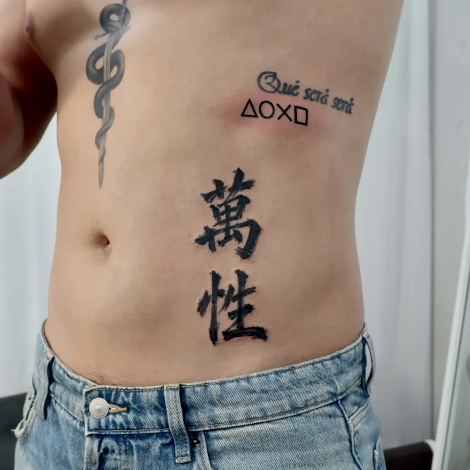
“If it is only a few little shapes, can I just pick the symbols?” Choosing a motif is a useful start. Where the shapes sit and how much space separates them are part of the conversation too. The photograph shows a triangle, a circle, crossed lines and a square in a horizontal row below existing lettering. The vertical brush-style characters have a different visual weight, with broad black strokes.
Yeonjae’s original caption describes pairing Chinese-character calligraphy with a tiny geometric tattoo. This guide looks at those two elements to help you describe the lines and spacing you would like. Calling a design small does not settle its spacing or composition.
Three useful comparisons in the photographs
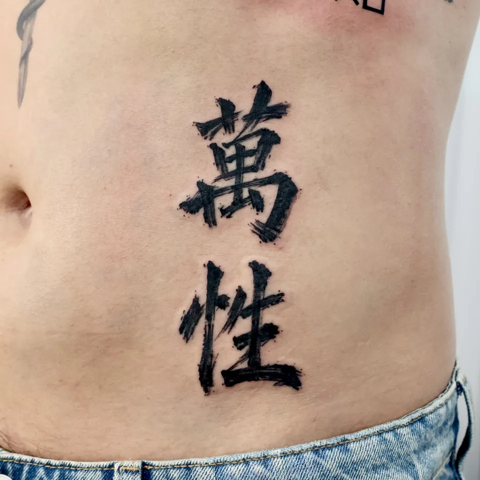
The outlined shapes leave skin visible inside them. The calligraphy uses more solid black area, with irregular stroke ends that suggest brush texture. You can compare how lines and filled areas create different visual emphasis, even within a black-ink composition.
| Element | What the photograph shows | What to discuss |
|---|---|---|
| Line and fill | Outlined shapes, broad character strokes | Outline or filled appearance |
| Direction | Horizontal shapes, vertical characters | Preferred orientation |
| Open space | Gaps between shapes and nearby lettering | Relationship to other tattoos |
Use the closer image to examine the character strokes and the wider image to look at the arrangement. A close view and a wider view help you look at the linework and the placement separately.
How should it relate to the tattoo already there?
For a placement inquiry, include a photograph that shows the surrounding tattoos as well as the space you have in mind. You might say, “I want the shapes to feel connected to the lettering,” or “I would prefer them to read as a separate piece.”
The length of the lettering, the direction of nearby designs and the available space can help frame a discussion about horizontal or vertical arrangement. Focus on the relationship you want between an addition and the existing composition. Mention whether a closely aligned row or a more open arrangement appeals to you.
Check the meaning and the exact characters separately
Simple geometry does not come with one fixed personal meaning. You can choose a shape because you enjoy its appearance, or discuss a memory you would like it to represent.
For lettering or characters, prepare the exact text and check its meaning and spelling independently. Liking the brush style is different from wanting the same characters. Separate the wording, the texture of the strokes and the arrangement when describing your idea. Check the meaning and spelling of the text you plan to use before your consultation.
A practical first message
Send a reference and one sentence about the shapes and spacing you have in mind. For example: “I like outlined shapes in a horizontal row, and I would like to discuss their distance from my existing lettering.” You can start that conversation without a finished drawing.
- Your preferred shapes or the exact text
- A reference and a current photo showing surrounding tattoos
- Your approximate preferred size and placement
- Your preference for line weight and orientation
Confirm the actual design and scale in an individual consultation. Discuss your tattoo on Instagram. Check the current booking information directly for prices and availability.
The artist and the sources behind this guide
The pictured work is by Yeonjae, a China Academy of Art graduate in her eighth year as a tattoo artist in Hongdae, as of 2026. She brings her artistic background and work experience to line flow, texture and the balance of a design on the body.
This guide explores two real work photographs and the original Instagram caption, with practical ideas for preparing your own design inquiry.
Before you book
Can I tell the exact tattoo size from these photos?
No scale or confirmed dimensions are supplied. Share your approximate preferred size and placement rather than estimating centimetres from the photograph.
What should I send if I already have nearby lettering?
Include a current photograph showing the lettering and the proposed area, and explain whether you want the new design to feel connected or separate.
Can I discuss different shapes or characters?
Send your preferred shapes or exact text as a starting point. The design, placement and scale are confirmed with the artist during consultation.
Key facts
- Location
- 2F, G Studio, 136-11 Eoulmadang-ro, Mapo-gu, Seoul, South Korea
- Opening hours
- Mon–Sat 11:00–23:00 · Closed on Sundays
- Artist
- Yeonjae · China Academy of Art graduate · eighth year in Hongdae (as of 2026)
- Styles
- Fine line · Floral & botanical · Cover-up
- Consultation & booking
- Confirmed after consultation via Instagram DM, LINE or KakaoTalk
- Pricing & time
- Price and session length depend on the design, size and placement, and are explained during the consultation.
China Academy of Art graduate, in her eighth year as a tattoo artist in Hongdae · as of 2026
China Academy of Art is an art university founded in Hangzhou in 1928. Its long history of art education provides context for Yeonjae’s fine-art background. About the academy · official website ↗
Yeonjae Tattoo · Blog
This post brings together the work photographs, published descriptions and guidance for preparing an inquiry. See the artist profile above for the creator’s background.
Photo source: Original artwork & context ↗