Which designs suit a handpoke tattoo look?
Hi, I'm Yeonjae, a tattoo artist in Hongdae, Seoul.
A handpoke tattoo look suits small, light designs where uneven, crayon-like lines are part of the charm: doodles, little symbols, music notes, stars and hearts that look natural even when drawn by hand. The photos in this post show two examples, a scribbled grid with an O and an x, and a loose row of music notes across the upper arm. Below I compare them with clean line work and explain what to bring to a consultation.
Everything here comes from two sources: the six photos you can see in this post, and the original English captions from my Instagram posts. Where a caption does not say why something was done, I do not guess. Photos 1 and 2 show the doodle design, and photos 3 to 6 show the music note design.
What does the doodle design in photos 1 and 2 look like?
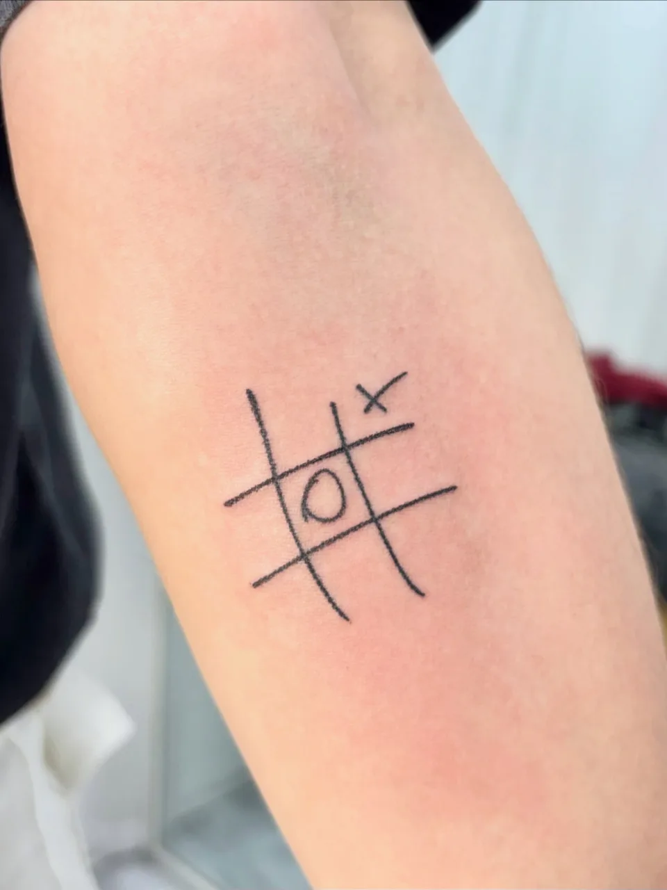
Photo 1 is a close view of a small design on an arm. Two vertical and two horizontal lines cross in a # shape, with a hand-drawn O in the middle square and a small x at the upper right. The ends of the lines are not cut straight; they bend a little, and the thickness changes slightly from stretch to stretch. The O is not a compass circle but a loose oval, as if it were drawn in one pass.
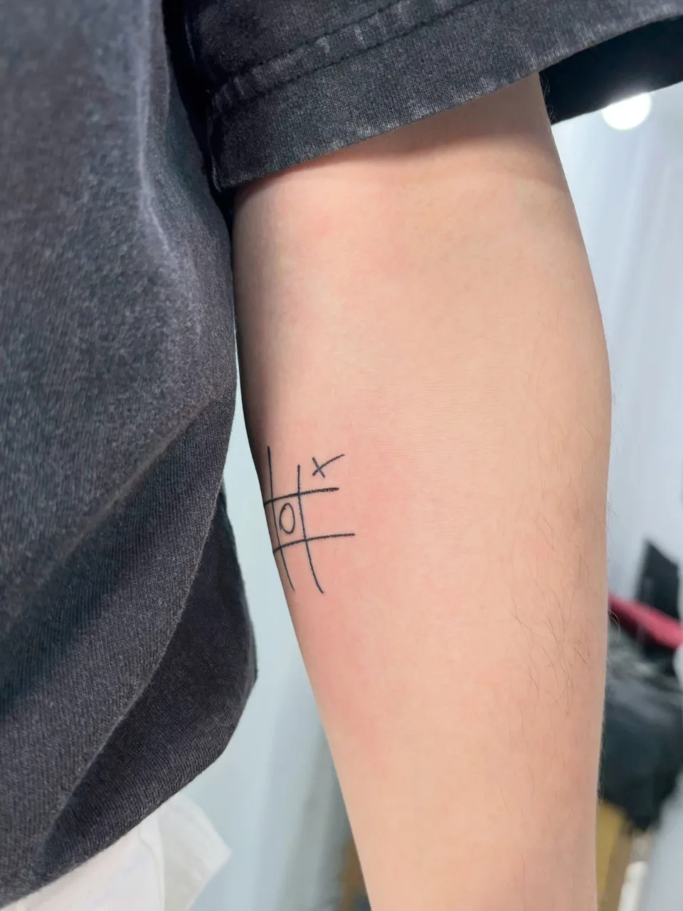
Photo 2 shows the same work from farther away. The grid sits on the side of the arm below a dark T-shirt sleeve, and the lines curve slightly with the arm. Because the design is small, you can see at a glance that it occupies only one side of the arm.
The caption of the post dated May 23, 2026 says this is a handpoke-style doodle tattoo inspired by a movie poster. It says the focus was on keeping the rough crayon-like texture and the natural, imperfect lines of the original design, and it calls the piece a small tattoo with a really unique atmosphere.
I will not add anything the caption does not say. It does not give a reason for the request, the reason for the placement, the method or the time it took, so this post does not cover them either. What this doodle tattoo shows is the result itself: a design that leaves the rough grain of scribbled lines as it is.
What can you see in the music note design in photos 3 to 6?
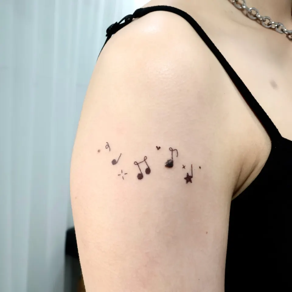
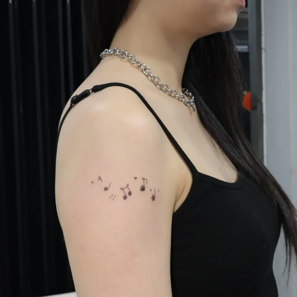
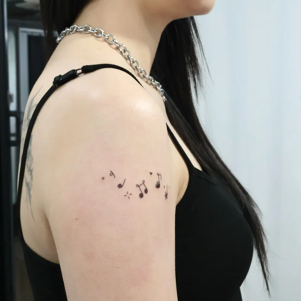
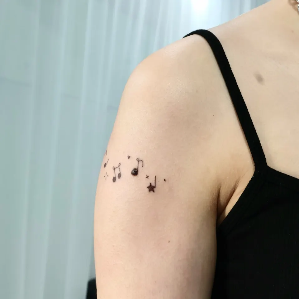
Photos 3 to 6 show a music note design on the upper arm near the shoulder. Several notes of different shapes are scattered in a row, with a small heart, stars, a sparkling cross shape, a small x and dots mixed in between. The note heads are not smooth circles; their edges look soft and slightly blurred, and the stems and stars differ a little from one to the next, as if drawn by hand.
Photo 3 is a close side view. Photo 4 is a wide view that includes the whole upper arm and the shoulder line, which makes it easy to judge the size and position of the design. Photo 5 is another wide view from a slightly different angle, and photo 6 is taken close to the shoulder, so one end of the row runs off the edge of the frame. The same design reads a little differently from each angle as the row follows the arm.
The caption of the post dated April 10, 2026 calls it a sparkling music note tattoo. It describes a soft hand-poked, crayon-like design placed around two existing spots. It also says the spots used to feel noticeable but now blend gently into the tattoo, which makes it easy to wear short sleeves again.
That is the caption for this one piece. How much a spot blends into a design depends on where it is and on the design, so I cannot promise it. If you are thinking about a design around a spot, bring a photo of that area and we will look at it together at the consultation.
How is a handpoke look different from clean line work?
Neither one sits above the other; they suit different kinds of design. Using the doodle in photos 1 and 2 and the music notes in photos 3 to 6 as a base, here is a general comparison.
| What to compare | Clean line design | Rough crayon texture design |
|---|---|---|
| Impression of the line | Even thickness and neat line ends | Thickness varies slightly and the ends wobble softly |
| Motifs that suit it | Detailed flowers and plants, thin curves, delicate lettering | Doodles, small symbols, scribbled notes, stars and hearts |
| What to look for in photos | Whether lines run without breaks and spacing is even | Whether the rough grain and wobble stay as the design intended |
| What to decide at the consultation | Line thickness and level of detail | How rough it should be and how much grain to keep |
My work centers on fine-line style, flowers and plants, and cover-ups, all as custom designs. So the same subject can be drawn with clean lines, or with the scribbled grain seen in photo 1. Rather than calling one better, the deciding point is the character of the image you bring.
For example, if you bring a doodle as a reference, first separate the parts where the wobbly line is the charm from the parts you would like tidied. That makes the direction easier to settle. You can see more small pieces like these in the mini tattoo work page.
What does handpoke generally mean as a method?
Handpoke is generally the name for a method that marks the skin dot by dot by hand instead of using a machine. When this post says handpoke tattoo, it does not rely on that general meaning. It follows the wording in the two post captions.
To sum up: the caption for photos 1 and 2 says handpoke-style doodle design, and the caption for photos 3 to 6 says a soft hand-poked, crayon-like design. Neither caption states which tool or method was used, so this post does not assume a method and only talks about the look of the designs.
It is also hard to guess a method from texture alone. Which method to use is decided at the consultation, after looking at the design. If you are thinking about a crayon texture tattoo or a doodle tattoo, it speeds things up to bring an image of the grain you like before talking about method names.
How do you choose a design and placement?
These points help you judge whether a rough texture will suit your idea.
- Does the motif look natural when drawn loosely? Grids, symbols, notes, stars and hearts work well because they do not look odd when hand-drawn.
- Is the rough grain already in the source image? If you want to keep the texture of an original design, as the caption for photo 1 describes, that original is the best reference at the consultation.
- Is it small? Both works here are small designs. The same design can look different at another size or placement, so size is decided together at the consultation.
- Where will it sit? Photos 1 and 2 are on the side of the arm, and photos 3 to 6 on the upper arm near the shoulder. Photos 2 and 4 show how lines look on the curve of an arm.
- Is there an existing mark or spot? In the caption for photos 3 to 6, the design was placed around two existing spots. In such a case a photo of the area is needed.
You do not need to meet every point. We look at your image and placement together and talk about whether rough texture or clean lines fits better.
What should you prepare before a consultation?
There is not much to show at a consultation. Tick off the list below and the conversation starts quickly.
- [ ] One to three reference images with the rough texture you like (a doodle, a sketch, part of a poster)
- [ ] A one-line note on which wobbly parts you want to keep as they are
- [ ] A photo of the area where you want the design (with any existing spot or mark in the frame)
- [ ] A rough idea of size and position
- [ ] Whether you would also like to see a clean line version
If you have no reference image, a description in words is fine. Price and working time depend on the design, size and placement, and they are explained at the consultation.
Where and how can you book a consultation?
Consultations are handled through Instagram DM. Send a reference image and a photo of the area, and we will look at the design and talk about which texture fits. The booking is confirmed after the consultation.
- Consultation channel: Message me on Instagram DM
- Location: 2F, G Studio, 136-11 Eoulmadang-ro, Mapo-gu, Seoul (near Hongik Univ. Station Exit 8)
- Price and working time: they depend on the design, size and placement and are explained at the consultation
Directions and details about the studio are in the Hongdae tattoo guide, and you can see how the work goes on the films page.
Who is the artist, Yeonjae?
Yeonjae is a female tattoo artist who graduated from the China Academy of Art and, as of 2026, is in her eighth year working in Hongdae. She studied fine art and works on fine-line, flowers and plants, and cover-ups as custom designs.
This post was written from the original Instagram captions and the photos. Reasons and backstories that are not in the captions are left out.
Before you book
Is every handpoke-looking tattoo made by hand?
The word usually points to marking the skin dot by dot by hand rather than with a machine. Still, neither caption names a tool or method. The actual method is settled together at the consultation once the design has been seen.
Can a roughly drawn doodle be used as the design as it is?
The caption for photos 1 and 2 says the focus was on keeping the rough crayon-like texture and imperfect lines of the original design. Send your reference image and we decide at the consultation which parts of its grain to keep.
Can I think about a design around an existing spot?
The caption for photos 3 to 6 says the design was placed around two existing spots. How much a spot blends in depends on its position and the design, so it is not promised. Send a photo of the area and we talk it through at the consultation.
How are price and working time explained?
Both vary with the design, size and placement. A booking is fixed once the consultation is finished, and the details are given then.
Key facts
- Location
- 2F, G Studio, 136-11 Eoulmadang-ro, Mapo-gu, Seoul, South Korea
- Opening hours
- Mon–Sat 11:00–23:00 · Closed on Sundays
- Artist
- Yeonjae · China Academy of Art graduate · eighth year in Hongdae (as of 2026)
- Styles
- Fine line · Floral & botanical · Cover-up
- Consultation & booking
- Confirmed after consultation via Instagram DM, LINE or KakaoTalk
- Pricing & time
- Price and session length depend on the design, size and placement, and are explained during the consultation.
China Academy of Art graduate, in her eighth year as a tattoo artist in Hongdae · as of 2026
China Academy of Art is an art university founded in Hangzhou in 1928. Its long history of art education provides context for Yeonjae’s fine-art background. About the academy · official website ↗
Yeonjae Tattoo · Blog
This post brings together the work photographs, published descriptions and guidance for preparing an inquiry. See the artist profile above for the creator’s background.
Photo source: Original artwork & context ↗