What should you decide first when planning a color tattoo?
Hi, I'm Yeonjae, a tattoo artist in Hongdae, Seoul.
Three questions come up again and again with a color tattoo. Should the whole design be filled with color, should one color sit on top of black and grey as an accent, and should that color be deep or soft? The short answer is that there is an order. Decide the range of color first (everything, one accent, or one color family), then match the depth of the color to the size, the placement and the line weight of the design.
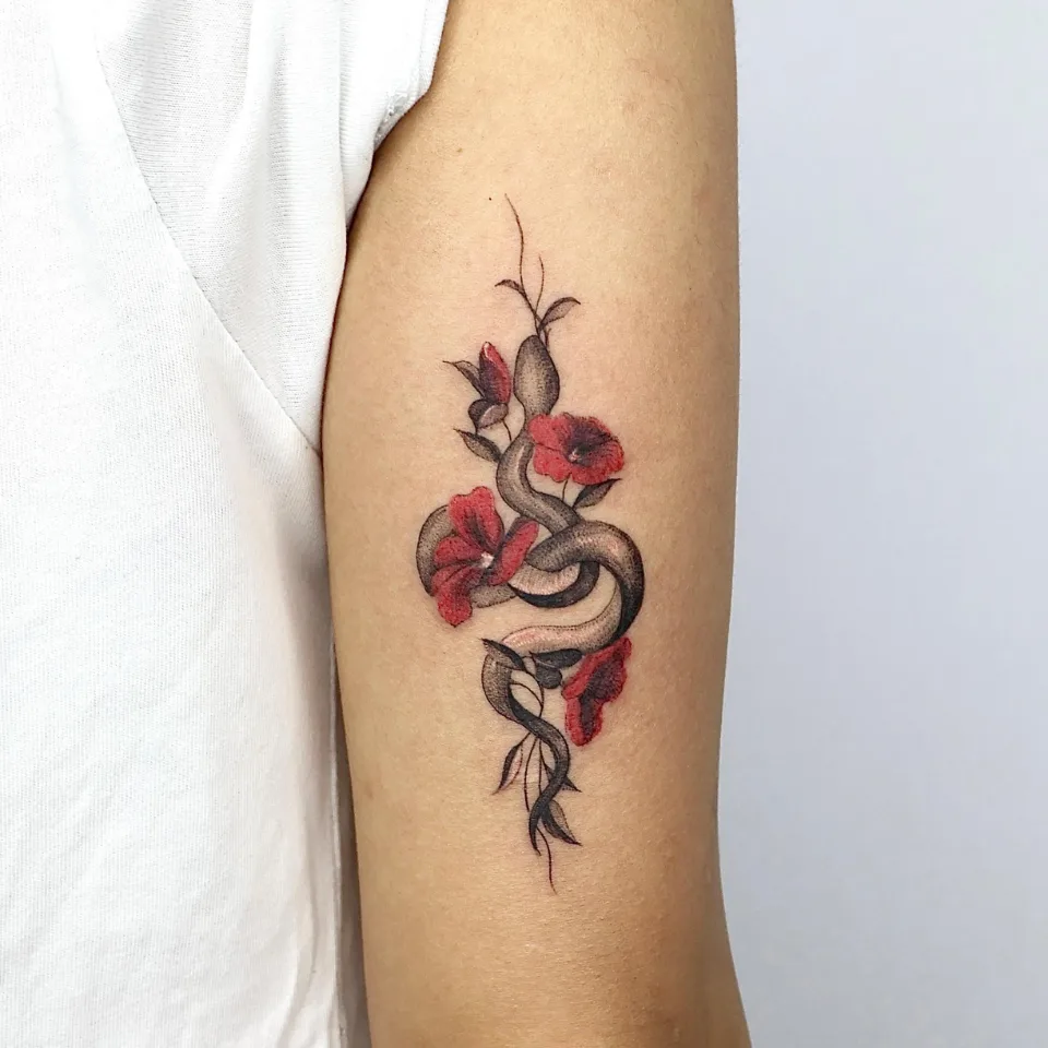
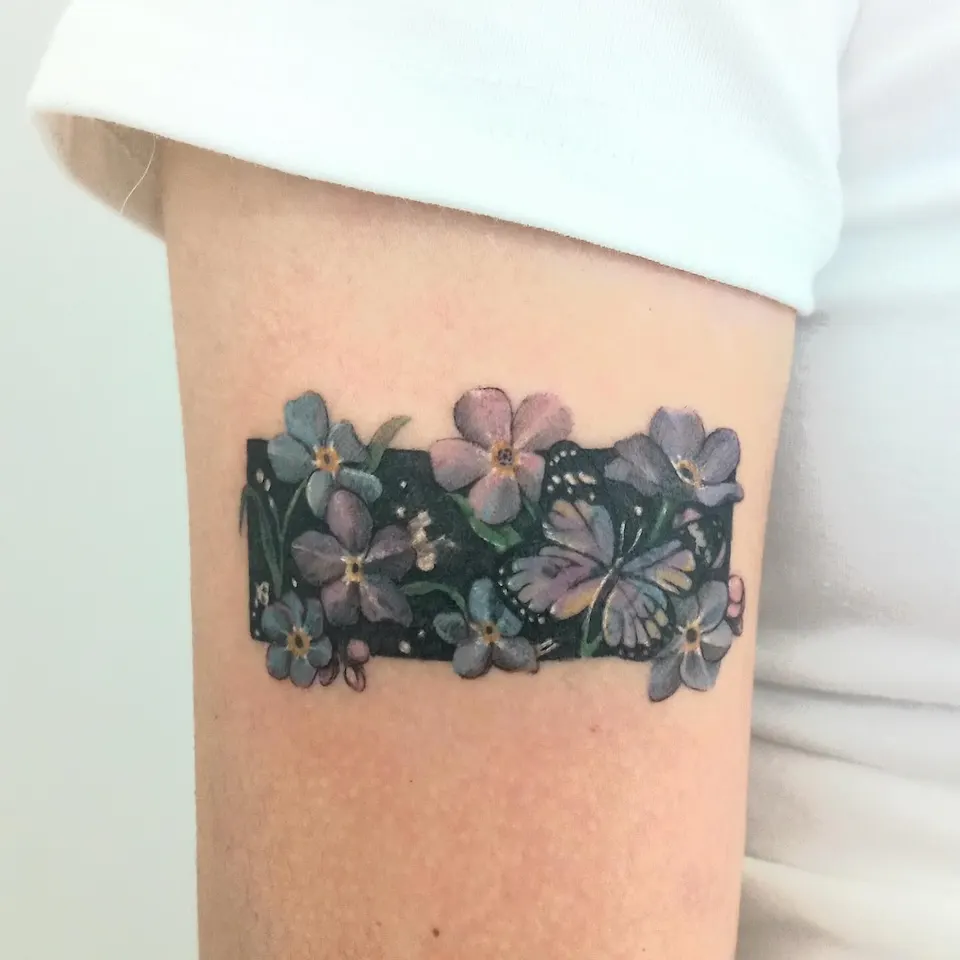
The comparison below uses seven photos from the Instagram account yeonjae_tattoo and one design image. Photo 1 shows a black-and-grey snake among flowers where only the flowers carry red. Photo 4 shows a dark panel filled with flowers and a butterfly in several colors. Both are color work, yet the color is used very differently, which is why choosing the range first saves time.
Only photo 2 and photo 8 have an original Instagram caption. For the other photos I describe only the shapes and colors that are visible, and I do not guess why a color was chosen. Photos without a caption are introduced as other work on the same theme.
How does a tattoo look with one accent color on black and grey?
With a single accent color, you can see at a glance where the color sits in the photo. Here are three cases that are visible in the photos.
The first is color only on the flowers. Photo 1 shows a snake winding between flowers and leaves on the upper arm. The snake and the leaves are black and grey stippled shading, and only the petals carry red, which turns darker toward the center of each flower. This photo has no caption, so I present it only as other work on the same theme. Adding one color to one black-and-grey drawing is what many people mean by a color accent tattoo.
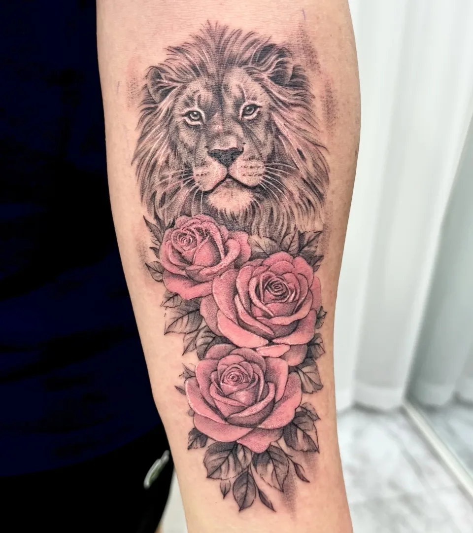
The second is a soft color used as the accent. Photo 2 shows a black-and-grey lion face on the forearm with three pink roses stacked below it. The mane and the leaves are black and grey shading, and soft pink appears only in the roses. The original caption describes one forearm piece that holds strength and elegance together, and says a soft pink touch adds balance to the bold.
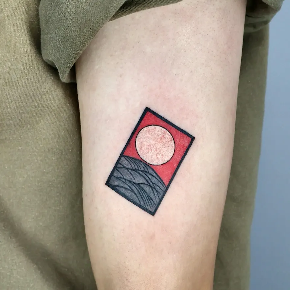
The third is color as a filled area. Photo 3 shows a tilted rectangular frame on the upper arm. The upper part of the frame is a red field with a pale circle, the lower part has grey wave-like lines, and the border is a black line. It has no caption either, so I describe only what is visible and do not say what the picture is meant to depict.
What the three photos share is that color is limited to a defined place. So the first decision in this layout is less the name of the color than which part of the design gets it.
How is a full-color piece different?
When many colors are used, each color has its own place in the photo. A color flower tattoo often falls into this group.
Photo 4 shows a black rectangular ground on the upper arm with small flowers and a butterfly placed on top. The flowers are in blue, purple and pink tones with yellowish centers, and the butterfly mixes purple and yellow. Green stems and small white dots are visible too. Because the ground is dark, the soft flower colors stand out against it.
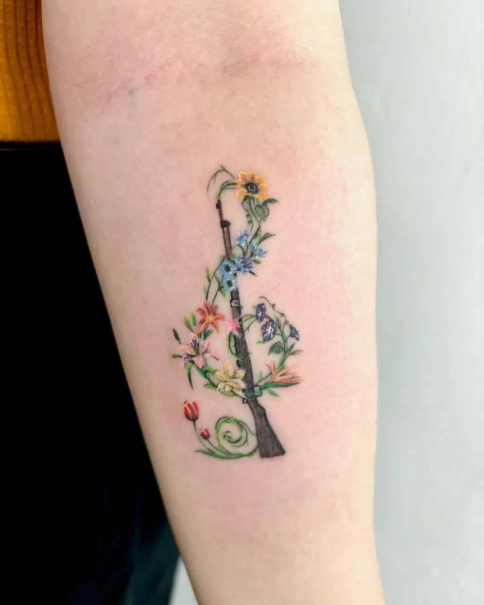
Photo 5 shows a long object with a wood-colored body and metal bands standing upright on the forearm, with green vines and many flowers winding around it. Yellow and blue flowers are near the top, orange, pink, yellow and purple flowers in the middle, and a red tulip-like flower near the bottom. There are many colors, but the green vines connect the flowers, so the whole reads as one group.
Neither photo has a caption. I do not know why these pictures were chosen or what they mean, so I leave that out and introduce them as other work on the same theme.
Filling the whole design adds one more decision. Colors meet each other in more places, so it helps to divide where each color goes at the design stage. For example, if a design has six kinds of flowers, you would talk through which color family each flower takes and whether green vines tie the spaces between them.
How do deep and soft colors compare in the photos?
Placing the photos side by side makes the difference in depth easy to see. What follows is only the impression the photos give.
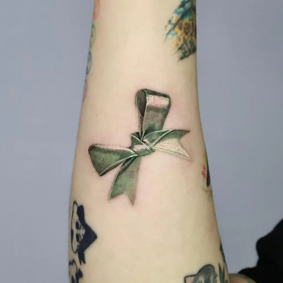
On the deeper side are the red field in photo 3, the red flowers in photo 1 and the green ribbon in photo 6. Photo 6 shows a green ribbon bow in the middle of the forearm. Within one green family, darker and lighter parts are used to draw the folds and the twist of the ribbon, and no separate outline stands out. There is no caption. Other drawings are also visible above and below it on the arm, but I do not separate which one belongs to this work. With deeper colors, the area of color comes into view first.
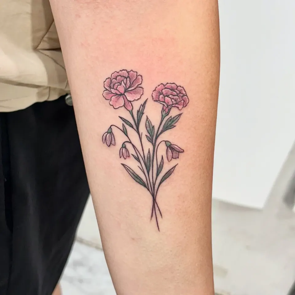
On the softer side are the pink roses in photo 2 and the flowers in photo 7. Photo 7 shows two pink flowers with ruffled petal edges, three small drooping buds and green leaves on the forearm. Thin black lines draw the outline and soft pink fills the inside. This photo has no caption either. With softer colors, the lines and shading come into view first, and the color supports them gently.
So when you choose the depth, ask yourself whether you want the colored area to look crisp, or whether you want color to sit inside lines and shading. How well a color settles and how long it lasts depend on your skin condition and aftercare, so I do not state that from photos alone and we confirm it at the consultation. If you are curious about a plum blossom branch placed on the arm and wrist, there is also a column on a plum blossom branch tattoo for the arm and wrist.
Which layout types are there, and how do they compare?
Here are the photos above sorted by type. The table lists only where the color goes and what the photo shows, and it leaves out any background about why the piece was made.
| Layout type | Photo | Where the color goes | What the photo shows | Worth considering |
|---|---|---|---|---|
| Black and grey + accent (flowers) | Photo 1 | The flowers | Snake and leaves in black and grey, red only on the flowers | Choose one part to be the lead |
| Black and grey + accent (soft color) | Photo 2 | Three roses | Lion and leaves in black and grey, soft pink roses | A gentle color on a design that is mostly black and grey |
| Black and grey + accent (area) | Photo 3 | Upper part of the frame | Red field with a pale circle, grey waves below | When color fills an area, the edge between areas matters |
| Many colors | Photos 4, 5 | Flowers, butterfly, vines | Blue, purple, pink, yellow, orange, green | Give each color its own place |
| One color family | Photo 6 | The whole ribbon | Light and dark steps of green | Few colors, so the light and dark steps do the work |
| Thin lines + soft color | Photo 7 | Inside the petals and buds, plus leaves | Fine black outlines with soft pink and green | Talk about the balance of line and color |
The point to notice in the table is how much black and grey there is. In photos 1, 2 and 3 the black and grey part is large and the color is gathered in one place. In photos 4 and 5 color spreads across the whole design. Photo 6 uses few colors but many light and dark steps.
How should you choose colors, step by step?
After looking at the photos, this order keeps things simple.
- Set the range. Decide whether the whole design is filled, one accent is added, or one color family is used.
- If it is an accent, choose the spot. Pick the one place you want the eye to reach first. In photo 1 it is the flowers, in photo 2 the roses, and in photo 3 the upper field.
- Choose the depth. If you want a crisp area, think of a deeper color; if you want to keep lines and shading in front, think of a softer one.
- Match size and placement. For example, if you want six colors in a design about the size of your palm, each color gets a very small area, so the number of colors and the size are discussed together.
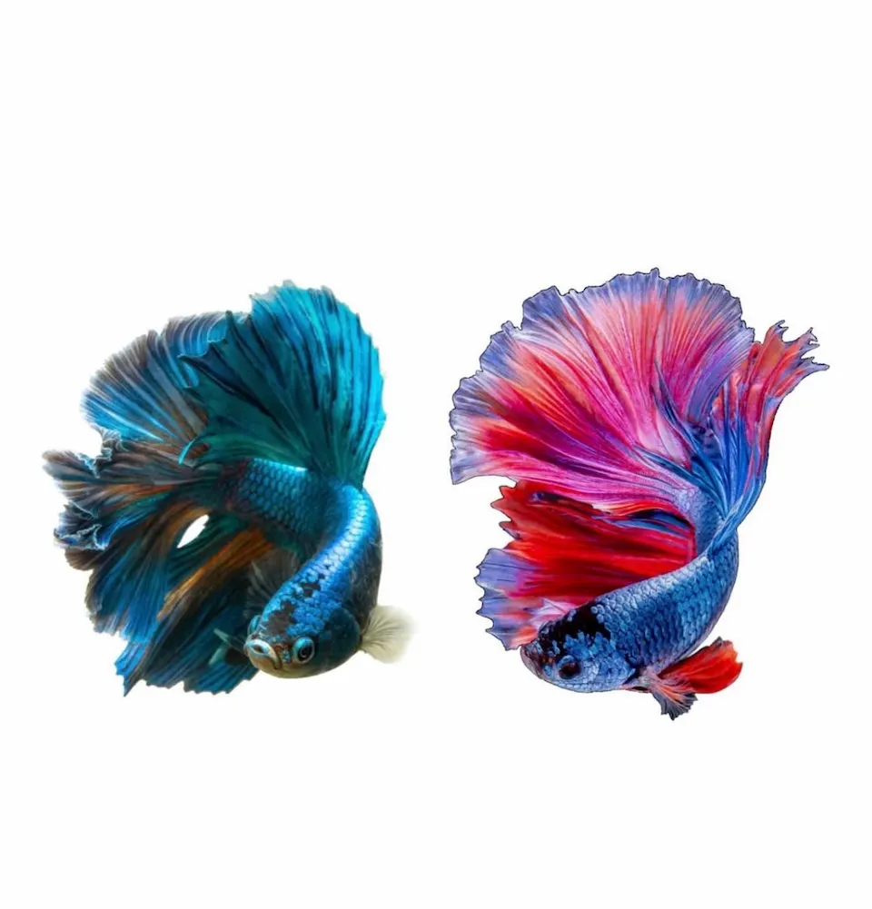
Colors can also be changed at the design stage. Photo 8 is a design image, not a photo of a finished tattoo. Its original caption says the design is inspired by the flowing fins and vivid colors of betta fish and that each color can be customized to your preference. The image shows two betta fish side by side, one in teal and blue tones and one mixing red, pink and purple. Because it is a design image, how it looks on skin can differ. To see more color work, browse the color work category.
What should you prepare before a consultation?
These items speed up the consultation. You do not need all of them.
- [ ] Two or three reference photos with a color feel you like (they do not have to be tattoo photos)
- [ ] The range of color you want: everything, one accent, or one color family, whichever is closest
- [ ] Candidate accent colors, and whether a deep or a soft shade appeals to you more
- [ ] The placement you have in mind and the rough size
- [ ] A photo of any existing tattoo near that spot
- [ ] Your preferred timing or dates
Reference photos can match only in color feel. Tell me what you like and dislike about each one, and it is easier to carry into the design.
How does the consultation work?
Consultations run through Instagram DM. Send reference photos, the placement and the size you have in mind, and we talk through the direction of the design together. The booking is confirmed after the consultation, and price and working time depend on the design, size and placement, so they are explained at the consultation.
- Consultation: Message on Instagram DM
- Location: 2F, G Studio, 136-11 Eoulmadang-ro, Mapo-gu, Seoul (near Hongik Univ. Station Exit 8)
If you want directions and more about the area, see the Hongdae tattoo guide.
Who is the artist behind this column?
Yeonjae graduated from the China Academy of Art and, as of 2026, is a woman tattoo artist in her eighth year in Hongdae. She studied painting (Fine Art) and works in fine line, flowers and plants, and cover-ups, using custom designs.
This column is based on the photos and original captions of the Instagram posts, and I did not write any reason that is not in the original text.
Before you book
Can a color tattoo use just one color?
Yes. Some designs keep black and grey and add only one color. Photo 1 puts red only on the flowers, and photo 2 uses soft pink only on the roses. Which part gets the color is decided at the consultation while looking at the design.
How do I choose between deep and soft colors?
In the photos, deeper colors show the area of color first, and softer colors let lines and shading show first. It depends on the size and placement, so we decide together at the consultation.
How long will the color last?
How long color lasts depends on your skin condition and aftercare, so I do not state it from photos alone. Please ask at the consultation.
How much does it cost and how long does it take?
It depends on the design, size and placement, and it is explained at the consultation.
Can the colors in a design be changed?
The original caption for the design in photo 8 says each color can be customized to your preference. How that applies to another design is confirmed at the consultation.
Key facts
- Location
- 2F, G Studio, 136-11 Eoulmadang-ro, Mapo-gu, Seoul, South Korea
- Opening hours
- Mon–Sat 11:00–23:00 · Closed on Sundays
- Artist
- Yeonjae · China Academy of Art graduate · eighth year in Hongdae (as of 2026)
- Styles
- Fine line · Floral & botanical · Cover-up
- Consultation & booking
- Confirmed after consultation via Instagram DM, LINE or KakaoTalk
- Pricing & time
- Price and session length depend on the design, size and placement, and are explained during the consultation.
China Academy of Art graduate, in her eighth year as a tattoo artist in Hongdae · as of 2026
China Academy of Art is an art university founded in Hangzhou in 1928. Its long history of art education provides context for Yeonjae’s fine-art background. About the academy · official website ↗
Yeonjae Tattoo · Blog
This post brings together the work photographs, published descriptions and guidance for preparing an inquiry. See the artist profile above for the creator’s background.
Photo source: Original artwork & context ↗