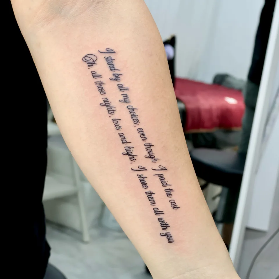
What went into this arm lettering, and where does it sit?
Hi, I'm Yeonjae, a tattoo artist in Hongdae, Seoul.
Today I'd like to share some of my recent arm lettering work. If you have a sentence you want to carry but feel unsure about the placement and the font before a Hongdae tattoo consultation, these pieces are a good place to start.
The first photo shows a long English sentence in cursive, split into two lines that slant down the forearm. In the post I described it as words about personal choices, the price of those choices, and every low and high along the way, a reminder to embrace the whole journey and everything that made you who you are today.
A long sentence reads best in two evenly spaced lines that follow the length of the forearm, while a short one sits comfortably on a single line. Below I go through how that showed up in each piece. Price and session length are easiest to ask about in the consultation.
What do the other pieces say, and what is behind the wording?
Even among arm lettering pieces, every sentence carries a different story. Here is what the posts say, matched to the photo numbers.
| Photo | Wording and layout | What the post says |
|---|---|---|
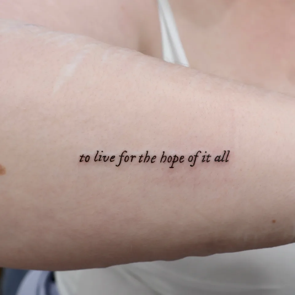
| 2 | "to live for the hope of it all," one line of lowercase italic across the forearm | A quiet reminder to keep living with hope, even through uncertain moments |
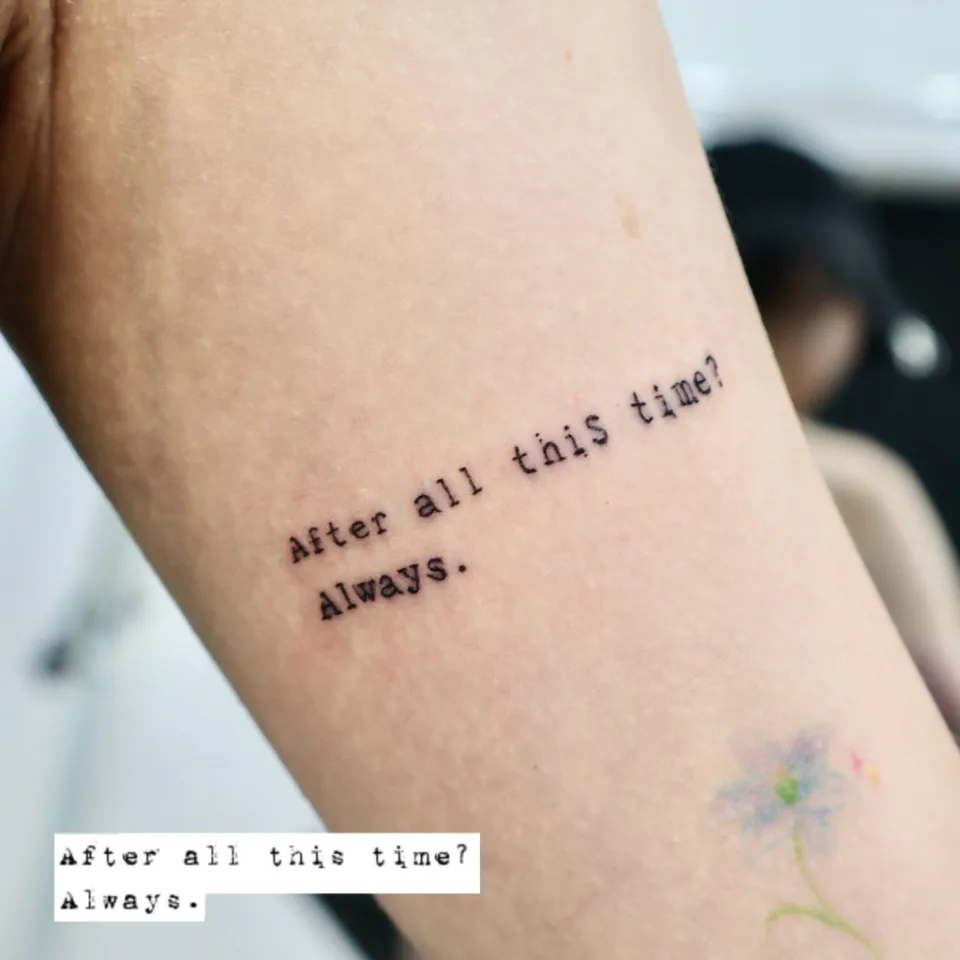
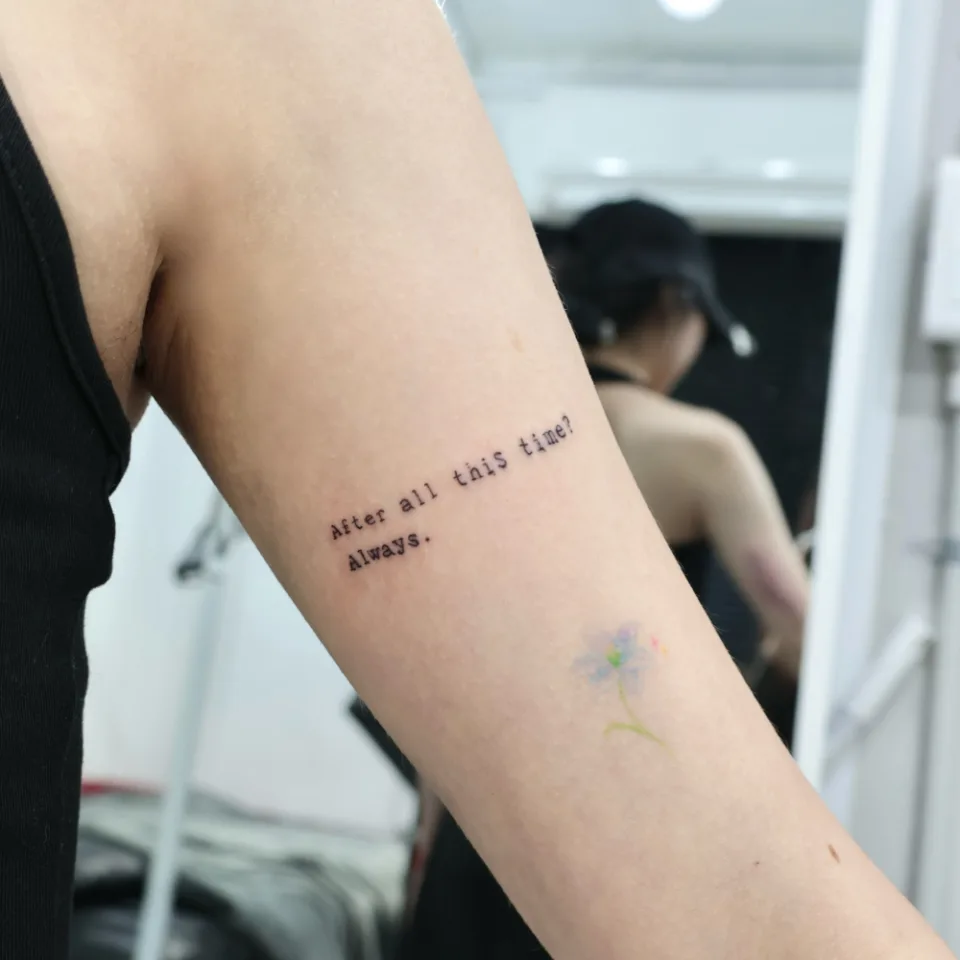
| 3, 4 | "After all this time? Always.", typewriter-style text in two lines on the upper arm | A Harry Potter line, chosen for the feeling of love and loyalty that stays unchanged over time |
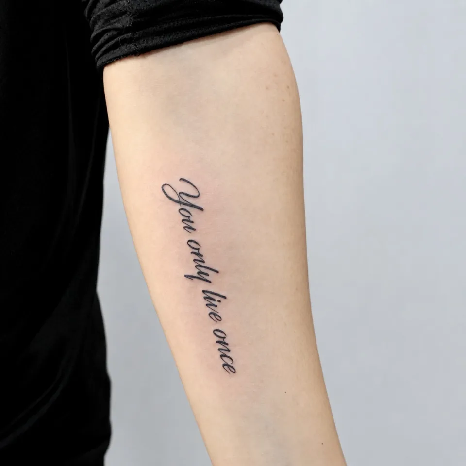
| 5 | "You only live once," one line in a clean font that follows the arm line | A classic lettering mood: simple, elegant and timeless |
| 6 | One line of thin cursive running vertically along the forearm | A personal phrase carried close, simple but full of meaning |
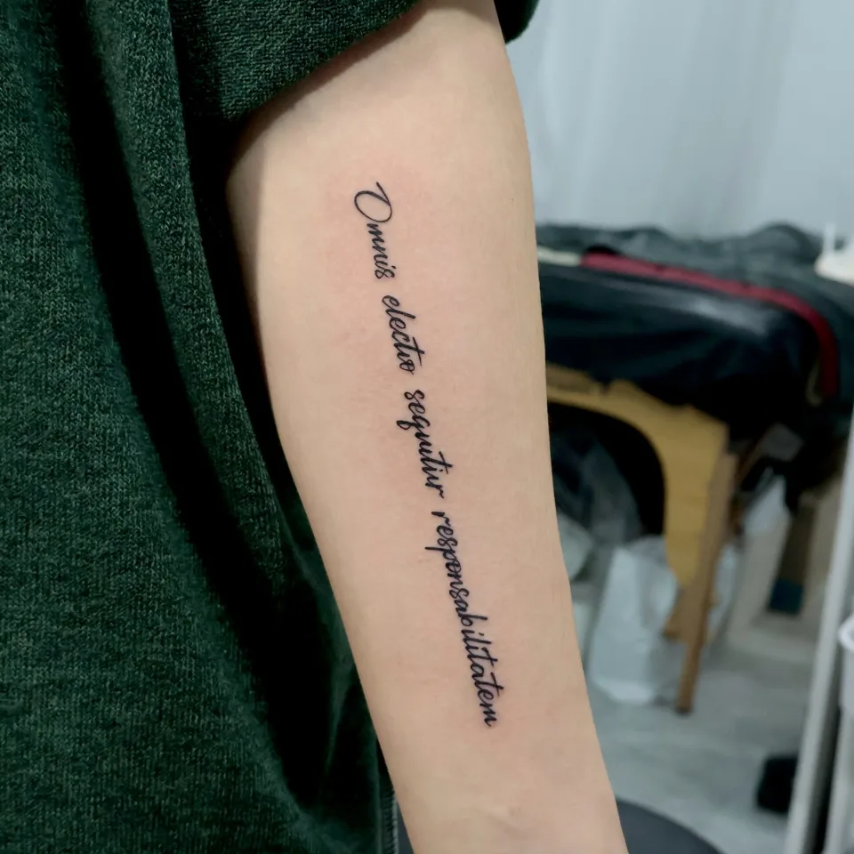
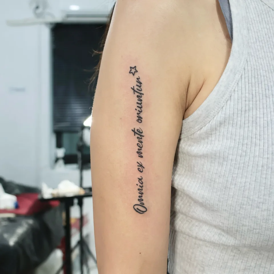
| 7 | "Omnia ex metu oriuntur" (Everything arises from fear), vertical cursive with a small star at the end | A reminder that many of the emotions, choices and challenges we face begin with fear |
The sentences differ, but they share one thing: each is a line someone wants to keep close for a long time. The post for photo 2 says as much, that a short sentence can hold a feeling you want to keep close. In photo 7 the script rises vertically along the arm, follows the shape of the body, and a small star finishes it off.
Why did these placements and fonts suit these sentences?
Three decisions stand out in the photos.
- Sentence length and space: The long English sentence is split into two lines that use the length of the forearm (photo 1), while a short single line fits within the width of the arm with generous space around it (photo 2).
- The character of the font: Flowing cursive (photos 1, 5, 6 and 7) follows the curve of the arm, while the typewriter-style letters (photos 3 and 4) stand apart one by one on a diagonal.
- Added elements: Photo 7 ends with a small star, and in photos 3 and 4 the text sits with a gap above a separate small flower tattoo.
Grouped by placement, it looks like this.
| Placement and direction | Photos | What you can see | Lines |
|---|---|---|---|
| Forearm, diagonal or vertical along the arm | 1, 5, 6 | Thin cursive runs a long way along the arm | One or two |
| Middle of the forearm, across | 2 | One lowercase italic line crosses the arm | One |
| Upper arm, at a slight angle | 3, 4 | Typewriter-style text on a diagonal, with a separate small flower tattoo below | Two |
| Back of the upper arm, vertical | 7 | One thin cursive line rises upward, with a small star at the end | One |
First, think about who you want to read the sentence. If it is for you, the side you can read while looking down at your arm suits it; if you also want others to see it, the side that shows when you roll up a sleeve suits it better. Look at the placements in photos 1 to 7 again with that question in mind and choosing a spot gets easier.
Along the forearm (vertical or diagonal) gives a long sentence plenty of room. Photo 1 puts two lines of a long English sentence here, and photos 5 and 6 put a single cursive line here. Check how the letters read when your arm hangs down and when you lift it.
Across the forearm is a tidy way to place a short phrase. The line has to fit within the width of the arm, so a longer sentence needs to be split into lines or turned along the arm.
The upper arm shows more or less depending on how long your sleeve is. In photos 3 and 4 the text keeps its distance from the small flower tattoo on the same arm, and photo 7 follows the curve of the back of the arm upward. If you'd like to see another upper arm piece, here is our name and arrow lettering post.
How do you decide on size, number of lines and line breaks?
Once the sentence is settled, size and line breaks are what people often ask about.
When you think about size, look at the length of the sentence, the width of the spot, and the size at which it stays easy to read, all together. They depend on each other, so fixing only one first tends to throw the others off.
- A short phrase: it can sit on one line within the width of the arm. Photo 2 puts one line across the middle of the forearm and leaves generous space around it.
- A long sentence: it can be split into two lines or run on a long diagonal. Photo 1 splits a long sentence into two lines along the forearm, and the even gap between the lines keeps it looking neat.
- One line, but a long one: as in photo 5, letting it slant gently along the line of the arm gives even a short phrase a sense of flow.
Line breaks read most comfortably at a natural pause in meaning. Photos 3 and 4 split the text into a first line ending in a question mark and a second line of a single short word. Breaking after a comma or a question mark lets the eye move smoothly to the next line. The same sentence changes shape depending on where it breaks, so I recommend comparing two or three line-break options.
The smaller the lettering, the more line thickness and the spacing between letters matter. If the gaps are too tight, letters can look joined together, so we check this together in the individual consultation once we see your wording and arm photo.
It is easier to decide size by laying the layout over a photo of your own arm than by choosing a number first. The actual size and what is possible are explained in the consultation.
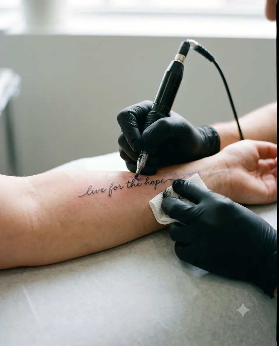
Cursive, italic or typewriter: which font suits you?
A font is easiest to judge by comparing photos. Even if you only say "cursive," everyone pictures a different shape, so bringing one photo you like is the most accurate way to show me.
- Cursive works well with the curve of the arm. The more the letters connect, the more important it is to check that they stay readable. For a sentence with unfamiliar spelling, please check it letter by letter.
- Italic is less decorative than cursive, so it suits a short phrase you want to keep clean.
- Typewriter keeps each letter distinct, so the structure of the sentence is easy to take in.
Photo 7 adds a small star at the end of one cursive line. If words alone feel a little bare, a single small symbol is one option. Photo 4 shows another: leaving some distance from a different tattoo on the same arm.
If you're curious about a large script placed along the side of the torso, have a look at our large script side tattoo post as well.
What should you prepare before the consultation? (checklist)
You don't need much. If you jot down these six things in your phone notes, the consultation goes much faster.
- Exact wording: spelling, spacing, and any full stops or question marks, written exactly as you want them.
- A photo of the part of the arm you have in mind: one with your arm relaxed and one with your sleeve rolled up, if you can.
- A font photo you like: the closest one among the seven above is enough.
- Capitalisation and line breaks: only the first letter capitalised or all lowercase, and where you would break the line.
- Small extras you would like: a star, a flower or a symbol, if you have something in mind.
- How much needs to stay covered: if sleeve length or a work or school setting matters to you, please tell us in advance.
Check the spelling and spacing of an English sentence once more. A single letter can change how the whole sentence reads.
How do you start a consultation by Instagram DM?
It's easy. Just send the following in this order.
- Open an Instagram DM to @yeonjae_tattoo. Open the Instagram DM
- Send the wording, a photo of the part of your arm, and a font photo you like from the checklist above. Share whatever you know.
- After we see your photos, we talk through size, line layout and what is possible in an individual consultation. Price and session length are also explained then.
The wording does not have to be finished. Send the placement and mood you like first. If you're looking for a Seoul tattoo studio and want a feel for our other work, you can also browse our films page.
Let’s talk about a tattoo that feels like you
Bring reference photos and tell us your preferred motif, size and placement.
Who is the tattoo artist behind this article?
I'm Yeonjae, a graduate of the China Academy of Art who, as of 2026, is in the eighth year of working as a tattoo artist in Hongdae. The academy is an art school founded in Hangzhou in 1928, and I bring that fine-art training to the flow of line, texture and balance on the body.
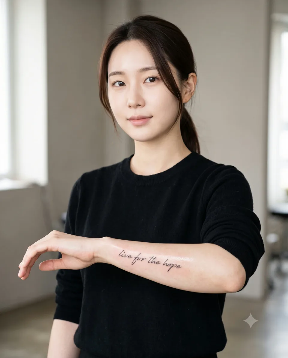
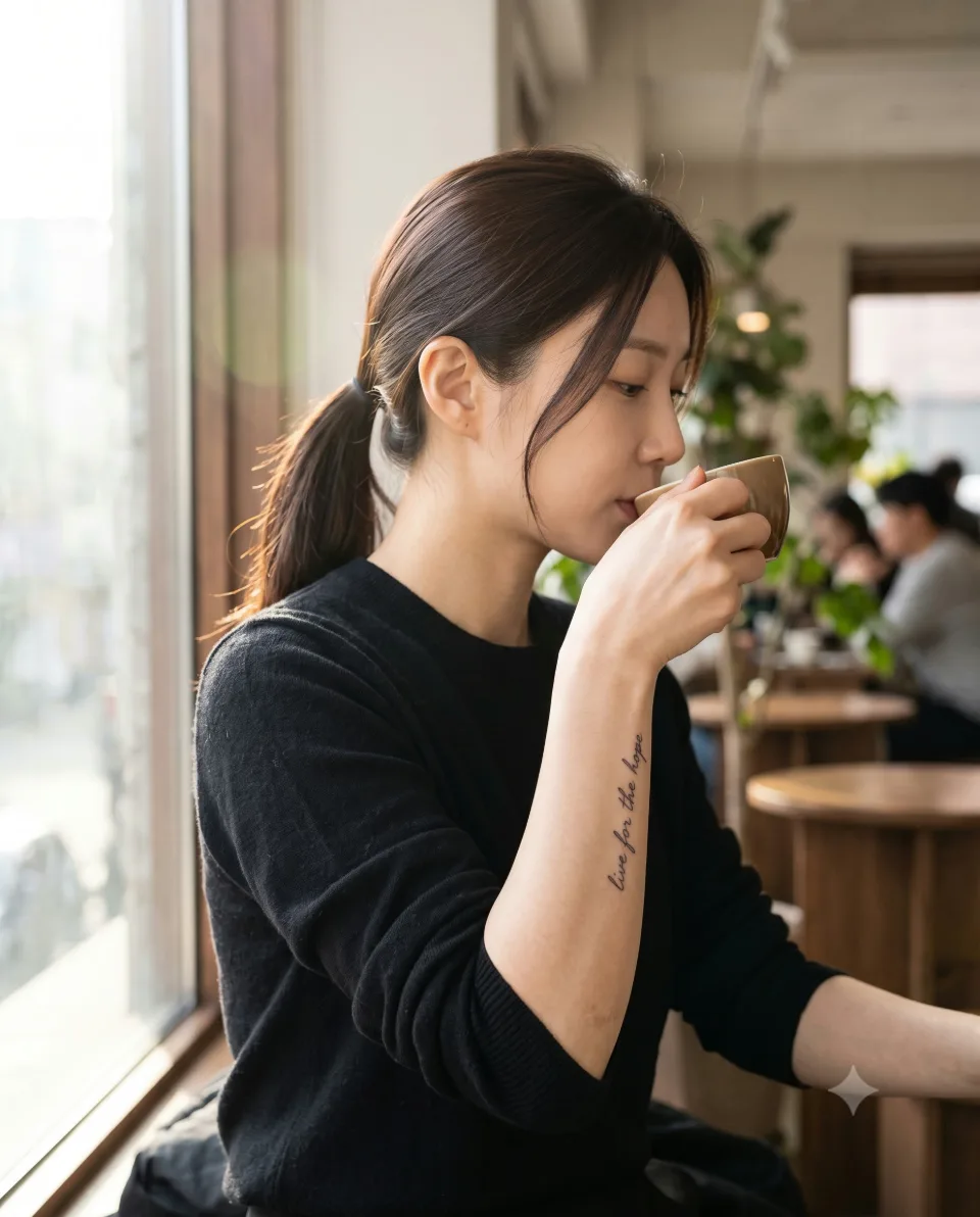
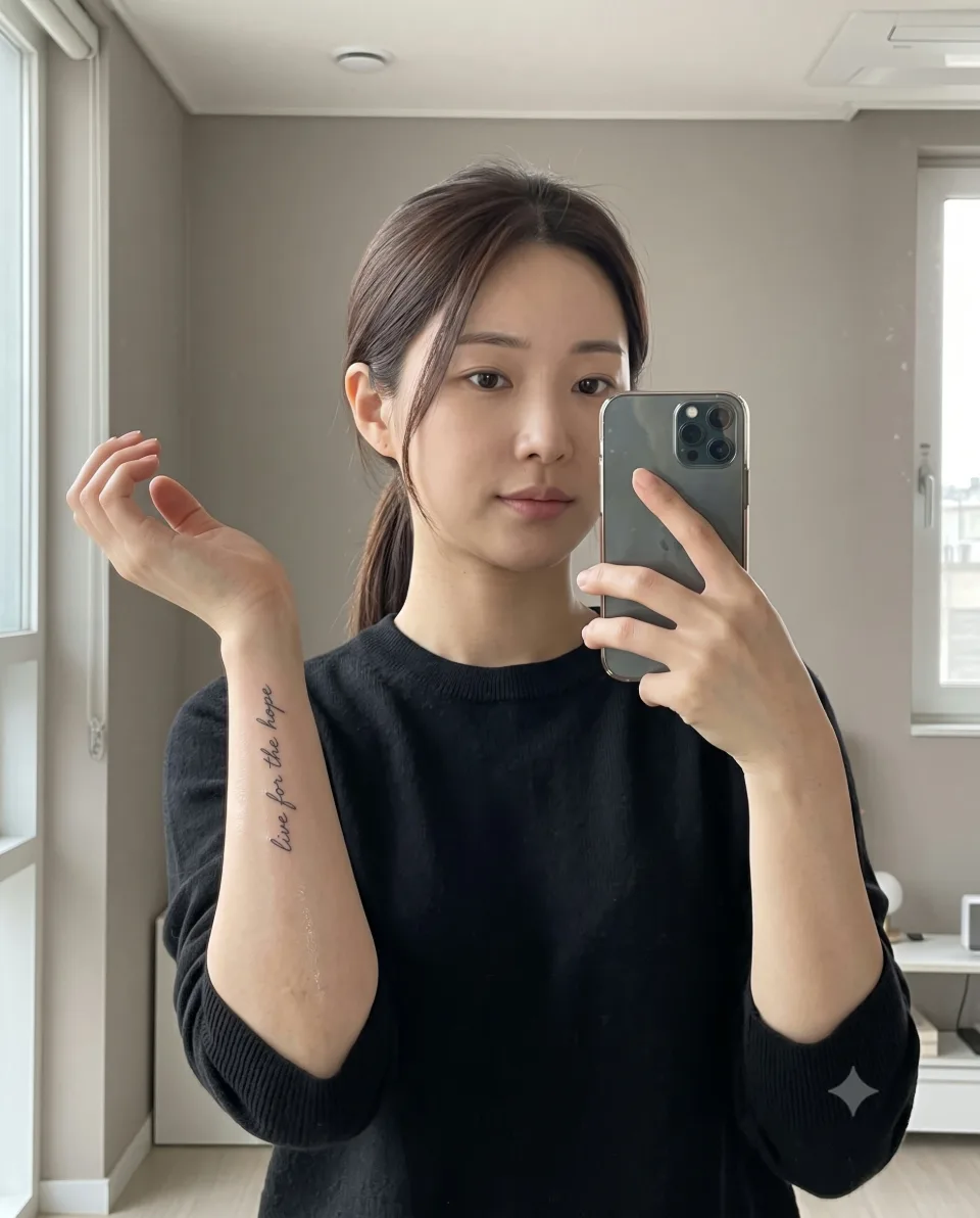
This article is based on lettering tattoo posts on the Yeonjae Tattoo Instagram account and seven photos I checked directly. The meaning behind each sentence is limited to what the Instagram posts say, and I have not added anything about the people who received them. The four AI-staged images above were made to help you picture a consultation, and they are not actual tattooing scenes or real clients.
Before you book
What should I send first for a Hongdae tattoo consultation about arm lettering?
Send the exact wording, a photo of the part of your arm you have in mind and a photo of a font you like by Instagram DM. Mentioning where you would break the line and how you would like it capitalised also speeds things up.
Is the forearm or the upper arm better for lettering?
In the photos, a long sentence tends to use the length of the forearm, while a short phrase can sit across it. The upper arm shows more or less depending on your sleeve length. We decide together in the consultation, based on the clothes you usually wear and the length of the wording.
How do I decide between one line and two lines?
In the photos, one-line pieces cross the forearm or follow the line of the arm, and two-line pieces run along the arm or sit at an angle on the upper arm. We compare line-break options based on the sentence length and the width of the spot in an individual consultation.
Can I have a consultation if I have not decided on the wording?
Yes, we can start with placement, mood and a font photo you like. Once the wording is set, please check the spelling and spacing once more.
How can I find out about price and session length?
They depend on the wording, placement and size, so this article does not state them. Message us on Instagram and we will go over price and session length with you in an individual consultation.
Key facts
- Location
- 2F, G Studio, 136-11 Eoulmadang-ro, Mapo-gu, Seoul, South Korea
- Opening hours
- Mon–Sat 11:00–23:00 · Closed on Sundays
- Artist
- Yeonjae · China Academy of Art graduate · eighth year in Hongdae (as of 2026)
- Styles
- Fine line · Floral & botanical · Cover-up
- Consultation & booking
- Confirmed after consultation via Instagram DM, LINE or KakaoTalk
- Pricing & time
- Price and session length depend on the design, size and placement, and are explained during the consultation.
China Academy of Art graduate, in her eighth year as a tattoo artist in Hongdae · as of 2026
China Academy of Art is an art university founded in Hangzhou in 1928. Its long history of art education provides context for Yeonjae’s fine-art background. About the academy · official website ↗
Yeonjae Tattoo · Blog
This post brings together the work photographs, published descriptions and guidance for preparing an inquiry. See the artist profile above for the creator’s background.
Photo source: Original artwork & context ↗
Original Instagram caption
Based on the artist’s supplied work notes. Editorial text was prepared with AI assistance.