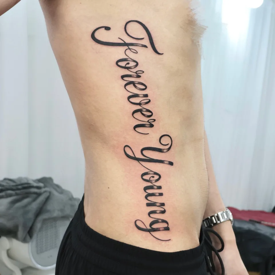
Which words did this large lettering tattoo use, and where on the body does it sit?
Hi, I'm Yeonjae, a tattoo artist in Hongdae, Seoul.
Today I'd like to share some large lettering tattoos I worked on recently. If you want to carry words big on your body but feel unsure about placement and size, and that has made you hesitate over a Hongdae lettering consultation, these pieces are a good place to start.
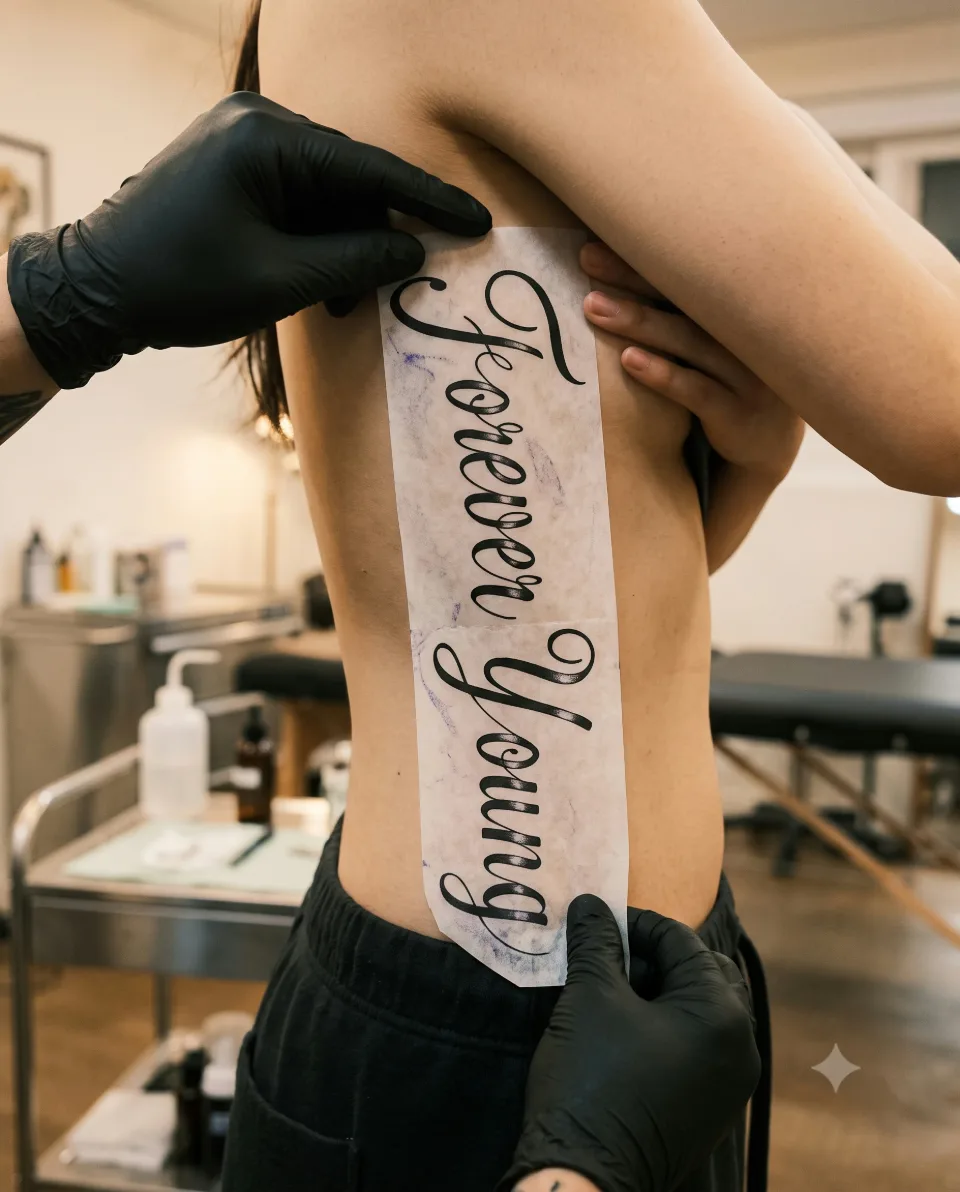
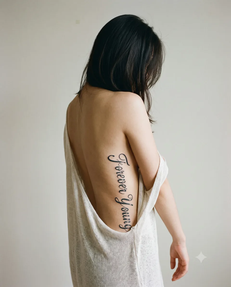
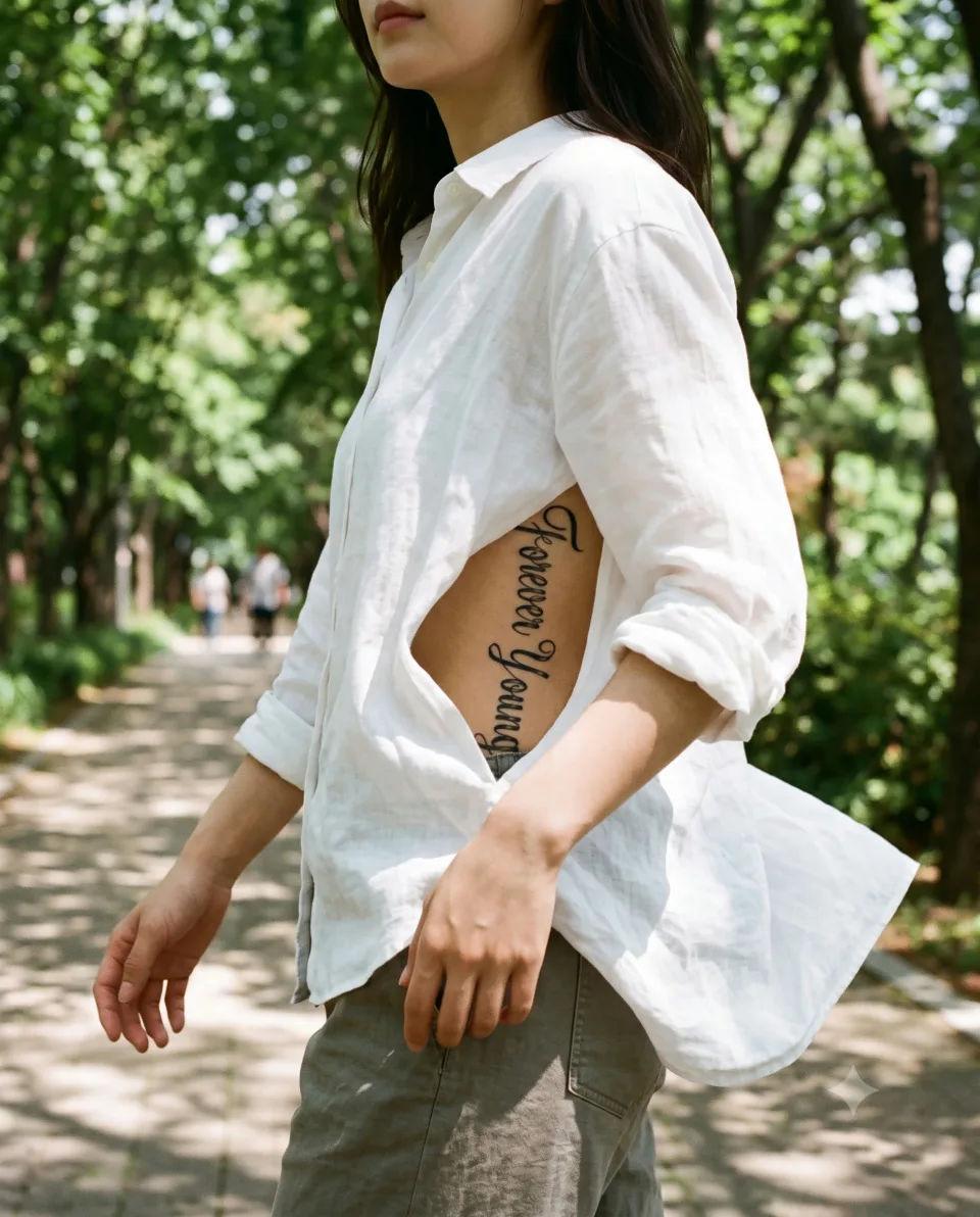
The first photo shows the English words Forever Young in large cursive, running vertically along the side of the body. The letters follow the line of the ribs below the armpit and come down to near the waistline. The post says the wording was inspired by a special connection to one artist's music, and describes it as a bold piece placed along the side of the body.
Large lettering is easiest to plan in the order of placement, thickness and length. Placement gives the words a line to follow, thickness decides how far away they can be read, and length is where you shape the sentence to fit both. If you wonder about price or timing, just ask when we talk.
What wording, shapes and placements do the other large pieces use?
Even among large lettering, the impression changes a lot with the placement and the shape of the letters. Each post describes its piece a little differently.
| Photo | What you can see | What the post says |
|---|---|---|
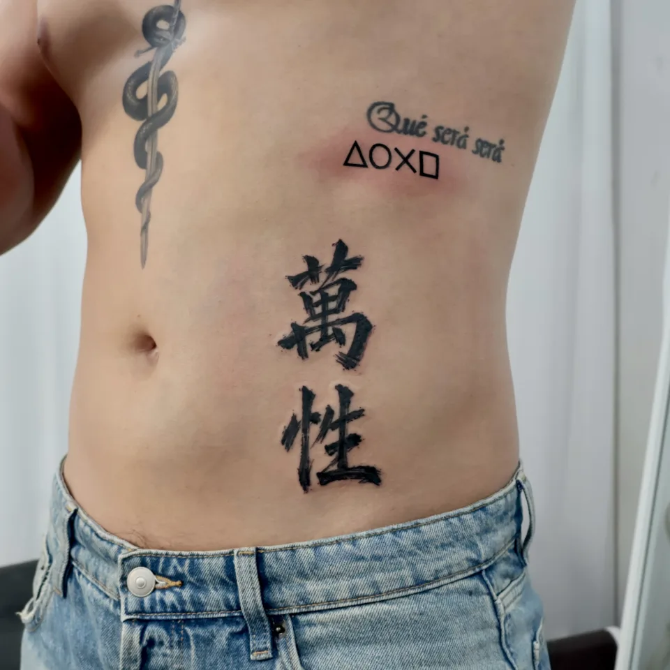
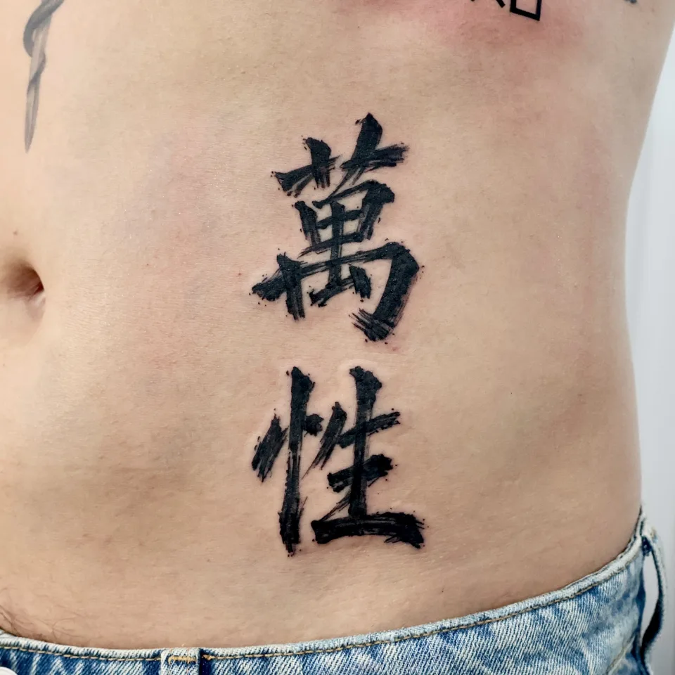
| 2, 3 | Two brush-calligraphy style characters sit one above the other at the center of the stomach, with a small geometric symbol beside them; up close you can see rough brush strokes and small splatter dots | Bold ink-like strokes and minimal shapes create a simple yet striking contrast, a clean combination with a strong presence and subtle detail |
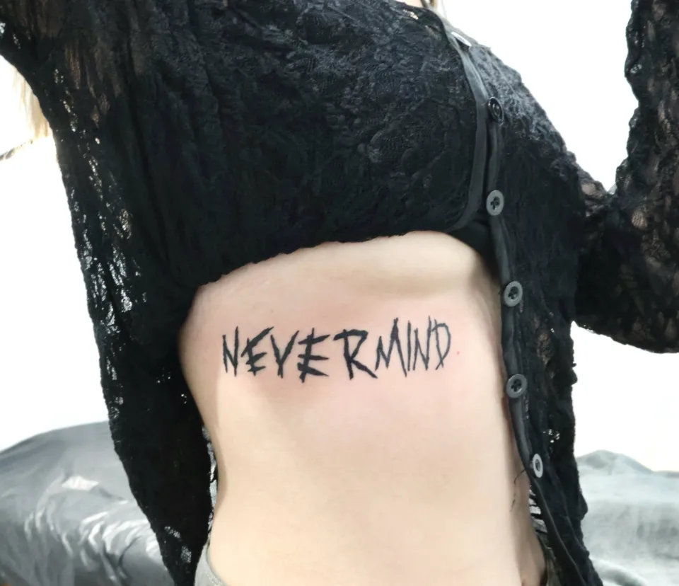
| 4 | A different piece on the same theme: one line of bold capital English across the ribs | The lines were not made too clean, to match the original mood, with a rough brush-style texture and slightly uneven hand-drawn details; the placement along the ribs added atmosphere and movement |
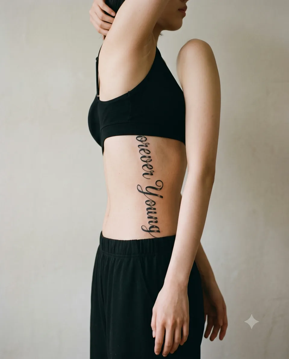
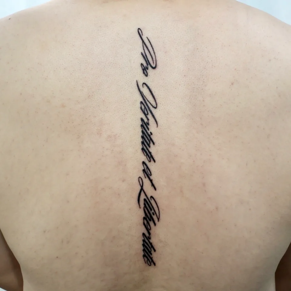
| 5 | A different piece on the same theme: one line of thin cursive runs down the spine on the back | Flowing along the spine, clean lines with quiet strength; minimal, balanced and timeless |
I have not explained what the characters in photos 2 and 3 mean; I only carried over what the post says. Photos 4 and 5 are different pieces on the same theme, so please do not read them as the same result as photos 1 to 3. They simply show how many ways large words can sit on a body.
Why did these placements and letter shapes suit these words?
Four decisions stand out in the photos. The intent the posts actually state is the bold piece along the side of the body in photo 1, the rough brush texture and rib placement in photo 4, and the clean lines flowing along the spine in photo 5, so the rest below is only what you can see.
- Following the lines of the body: In photo 1 the letters curve slightly along the side of the ribs and come down to near the waistline. In photo 5 one line runs straight down the spine, which looks balanced left and right.
- Letter size against the body surface: The two words in photo 1 use a long stretch of the side, while the two characters in photos 2 and 3 sit at the center of the stomach in line with the midline, short but strong.
- Stroke character and spot: The rough brush characters and the rough capitals (photos 2, 3 and 4) sit on fairly flat areas such as the ribs and stomach, so the texture of the strokes shows.
- Distance from other tattoos: In photo 2 the characters keep their distance from the small symbol and the line of English above them and from the snake tattoo beside the chest.
Grouped by placement and direction, it looks like this.
| Placement and direction | Photos | What you can see |
|---|---|---|
| Side to waistline, vertical | 1 | Two words in large cursive run long down the side of the ribs |
| Center of the stomach, vertical | 2, 3 | Two brush-calligraphy style characters sit one above the other |
| Ribs, horizontal | 4 | One line of bold capitals sits across the side |
| Spine on the back, vertical | 5 | A thin cursive sentence runs a long way down the spine |
Down the side is one of the places that can carry the longest words. The lines of the body change when your arm is down and when it is raised, so check both a standing pose and a raised-arm pose. The center of the stomach reads straight on from the front, so how much distance to leave from other tattoos is part of the decision. Across the ribs, the line reads from the front when the top is lifted. Along the spine sits on the center of left-right symmetry, so it matters that the center of the lettering matches the spine.
If you'd like to start from a smaller single line, have a look at our arm lettering placement and size post.
How do you choose stroke thickness and texture, and the length of the sentence?
In large lettering, thickness decides the distance from which it can be read. Sorted by thickness, the photos look like this.
- Cursive with both bold strokes and thin connecting lines (photo 1): the thick parts of the letters are filled in dark while the connecting lines stay thin. You can see stippled shading fading at the ends of the thick strokes, and details like this give large lettering a soft sense of depth.
- Rough brush strokes (photos 2 and 3): the edges of the strokes are rough, as if written with a brush, with small splatter dots here and there. Up close in photo 3 you can see a grain as though each stroke was pulled in a single motion.
- Bold capitals (photo 4): the whole line has an even weight and stands upright, with jagged, split stroke ends that feel hand-drawn.
- Thin cursive (photo 5): the lines are thin and long, so from a distance it reads as a single line flowing down the spine, and the letter shapes read up close.
The same sentence changes a great deal with thickness. Bold lettering catches the eye from a distance, while thin lettering has a quiet feel that reads up close. Think about which is closer to the way you'd like to say it.
Alongside thickness, look at the spacing between letters relative to their size. With bold strokes, tight gaps can make letters look joined, so we check this together in the consultation once we see your wording and a photo of the area. Compare drafts to decide whether the stroke texture should be rough or smooth.
Rather than fixing a thickness as a number, bringing one photo you like is the most accurate way. A single photo tells me far more than words.
The longer the sentence, the longer large lettering follows the line of the body. In photo 1 two words run from the ribs to near the waistline, filling most of one side, and in photo 5 one line runs a long way down the spine. In photo 2, by contrast, two characters sit much shorter on the same stomach. More letters mean each letter has to be smaller, and fewer letters mean one letter can be larger.
Here are some things to think about when you choose the sentence.
- Who the words are for: words you say to yourself might sit where your own eyes fall, while words you'd like others to see might sit where they show in daily life.
- Whether it reads as one line: set vertically, you have to tilt your head to read it, so the longer the sentence, the more the reading direction needs checking.
- Whether the meaning survives a trim: if the sentence is long for the line of the body, we can look at shorter wording together.
I don't guess at the meaning of any wording. Send me the exact words you'd like, and please check the spelling and spacing once more. For an unfamiliar language such as Chinese characters or Latin-style phrases, I recommend confirming the meaning and each stroke before the consultation.
It is easier to decide length by laying the letters over a photo of your own body than by picking a number. The actual size and what is possible are explained in the consultation.
How do language and lettering style change the feel of the words?
The same words give a different mood depending on the lettering style and language. Here are the five photos compared.
- English cursive suits the curves of the body and works well for long lettering. The more the letters connect, the more important it is to check that they read.
- Chinese brush characters have great presence even with few characters. One stroke can turn a character into a different one, so checking the original is especially important.
- Hand-lettered capitals suit a firm, single line.
- Thin cursive stands out on a long vertical place like the spine.
Change the language and style, and the same words take on a completely different mood. A sentence that reads lightly in English may feel heavy in Chinese brush strokes. Start by picturing the feeling you want it to carry.
If you're curious about lettering paired with ornaments, such as a name and an arrow, there is our name and arrow band post. And if you'd rather start with one small symbol, have a look at our mini symbol first tattoo post too.
What should you prepare before the consultation, and how will it look day to day? (checklist)
You don't need much. If you jot down these six things in your phone notes, the consultation goes much faster.
- The exact wording: spelling, spacing and capitalisation, written exactly as you want them. For Chinese characters or an unfamiliar language, please confirm the original.
- Photos of the area: from the front, from the side and with your arm raised, so we can see the lines of your body.
- A lettering photo you like: the closest of the photos above is enough.
- The direction for thickness and size: a rough sense of bold and dark or thin and long.
- Existing tattoos: if you have other tattoos nearby, tell us where.
- How much needs to stay covered: if the clothes you wear or a work or school setting matters to you, please tell us in advance.
Day to day, large lettering on the side or back is usually covered by clothes, and shows when you lift a top or turn. Lettering at the waistline can show more or less depending on the height of your trousers. If you tell us the height of the clothes you usually wear and where your body folds when you sit, it helps us decide the placement. Because skin and placement differ, I'm not giving a one-size-fits-all aftercare method here. When we meet, please ask how aftercare is handled.
How do you start a large lettering consultation by Instagram DM?
It's easy. Just send the following in this order.
- Open an Instagram DM to @yeonjae_tattoo. Open the Instagram DM
- Send the exact wording, photos of the area and a lettering photo you like from the checklist above. Share whatever you know.
- After we see your photos, we talk through thickness, length, placement and what is possible in an individual consultation. Price and session length are also explained then.
The wording does not have to be finished. Send the placement and mood you like first, and we will look at your photos together and find the lettering direction that suits the line of your body.
Let’s talk about a tattoo that feels like you
Bring reference photos and tell us your preferred motif, size and placement.
Who is the tattoo artist behind this article?
I'm Yeonjae, a graduate of the China Academy of Art who, as of 2026, is in the eighth year of working as a tattoo artist in Hongdae. The academy is an art school established in Hangzhou in 1928, and I try to bring the sense of line I built there to the direction and weight of letters on the curves of the body.
This article is based on the large lettering posts on the Yeonjae Tattoo Instagram account and work photos I checked directly. Photos 1 to 3 are the main pieces, and photos 4 and 5 are different pieces on the same theme. What the words carry is limited to what the posts say, and I have not added anything about the people who received them. The four AI-staged images were made to help you picture the scenes, and they are not real clients or actual tattooing scenes.
Before you book
Where on the body is best for large lettering?
The photos show the side vertically, the middle of the stomach, the side horizontally and along the spine. It depends on the length of the wording, the clothes you usually wear and how visible you want it, so we decide together in an individual consultation with photos of your body.
Should the lettering be bold or thin?
Bold lettering catches the eye from a distance, and thin lettering has a quiet feel that reads up close. Compare the pieces in the photos, tell me which you prefer, and we decide with the drafts.
Is an unfamiliar language such as Chinese characters or Latin-style wording possible?
Send the exact words and we will look at the style and layout in the consultation. For an unfamiliar language, I recommend confirming the meaning and each stroke beforehand. I do not guess at the meaning of wording.
Can large lettering go near an existing tattoo?
Photo 2 shows a piece on the same part of the body as other tattoos. We decide the spacing and direction in an individual consultation with a photo of the area.
How can I find out about price and session length?
They depend on the length, thickness and placement of the lettering, so this article does not state them. Message us on Instagram and we will go over price and session length in an individual consultation.
Key facts
- Location
- 2F, G Studio, 136-11 Eoulmadang-ro, Mapo-gu, Seoul, South Korea
- Opening hours
- Mon–Sat 11:00–23:00 · Closed on Sundays
- Artist
- Yeonjae · China Academy of Art graduate · eighth year in Hongdae (as of 2026)
- Styles
- Fine line · Floral & botanical · Cover-up
- Consultation & booking
- Confirmed after consultation via Instagram DM, LINE or KakaoTalk
- Pricing & time
- Price and session length depend on the design, size and placement, and are explained during the consultation.
China Academy of Art graduate, in her eighth year as a tattoo artist in Hongdae · as of 2026
China Academy of Art is an art university founded in Hangzhou in 1928. Its long history of art education provides context for Yeonjae’s fine-art background. About the academy · official website ↗
Yeonjae Tattoo · Blog
This post brings together the work photographs, published descriptions and guidance for preparing an inquiry. See the artist profile above for the creator’s background.
Photo source: Original artwork & context ↗
Original Instagram caption
Based on the artist’s supplied work notes. Editorial text was prepared with AI assistance.