Does the texture of the lettering really change the mood of the same phrase?
Hi, I'm Yeonjae, a tattoo artist in Hongdae, Seoul.
Yes, the texture of the lettering changes the mood of the same phrase quite a lot. People planning a handwriting tattoo, or any other quote tattoo, usually settle the words first and then get stuck on one question: what should the letters themselves feel like? To help with that, I lined up eight photos of lettering I have done and compared three directions side by side: rough brush strokes, playful handwriting with color, and a clean font.
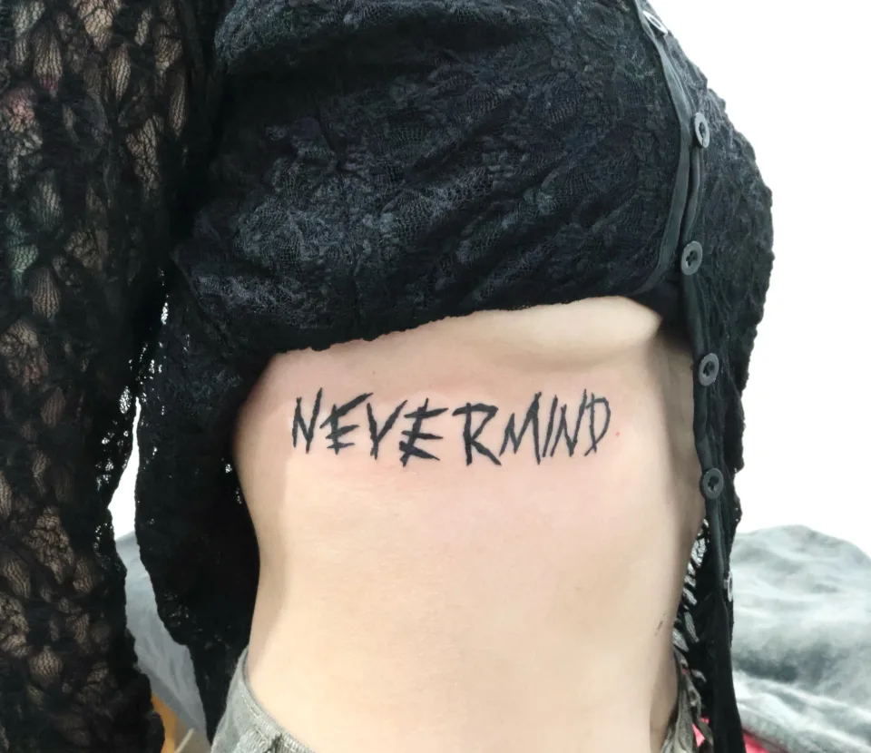
Photo 1 is the first example. The black capital letters have pointed ends and uneven stroke widths, and they sit in a single line. Even with a plain alphabet, writing the letters this roughly gives them a very different expression from a tidy typeface.
Everything below comes from the original Instagram captions and from what is visible in the photos. Where the caption gives no reason, I have not guessed one.
How was the rough brush-style lettering worked out?
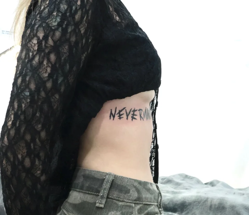
Photos 1 and 2 show the English word "Nevermind." According to the caption, the person who had it done was visiting Korea for the BTS concert and brought in the Nevermind lettering inspired by Jimin. That is as far as the caption goes on anything related to the celebrity.
The design direction in the caption is clear. To match the original mood, the lines were not made too clean. The caption describes a rough brush-style texture with slightly uneven, hand-drawn details. In photo 1 you can see it: the ends of several strokes are pointed or split, and the thickness and tilt change from letter to letter, like marks dragged quickly with a brush.
The placement is along the ribs, and the caption says this gave the tattoo an even stronger atmosphere and movement. In photo 2, seen from the side, the word follows the line of the body, and the right end is partly hidden by the edge of the clothing.
A rough texture adds force to a phrase, but because the shapes are less regular than a typeface, it is worth checking how easily the words can be read. In this piece the phrase is a single word on one line, so the letter shapes are easy to follow.
What changes when playful handwriting gets color?
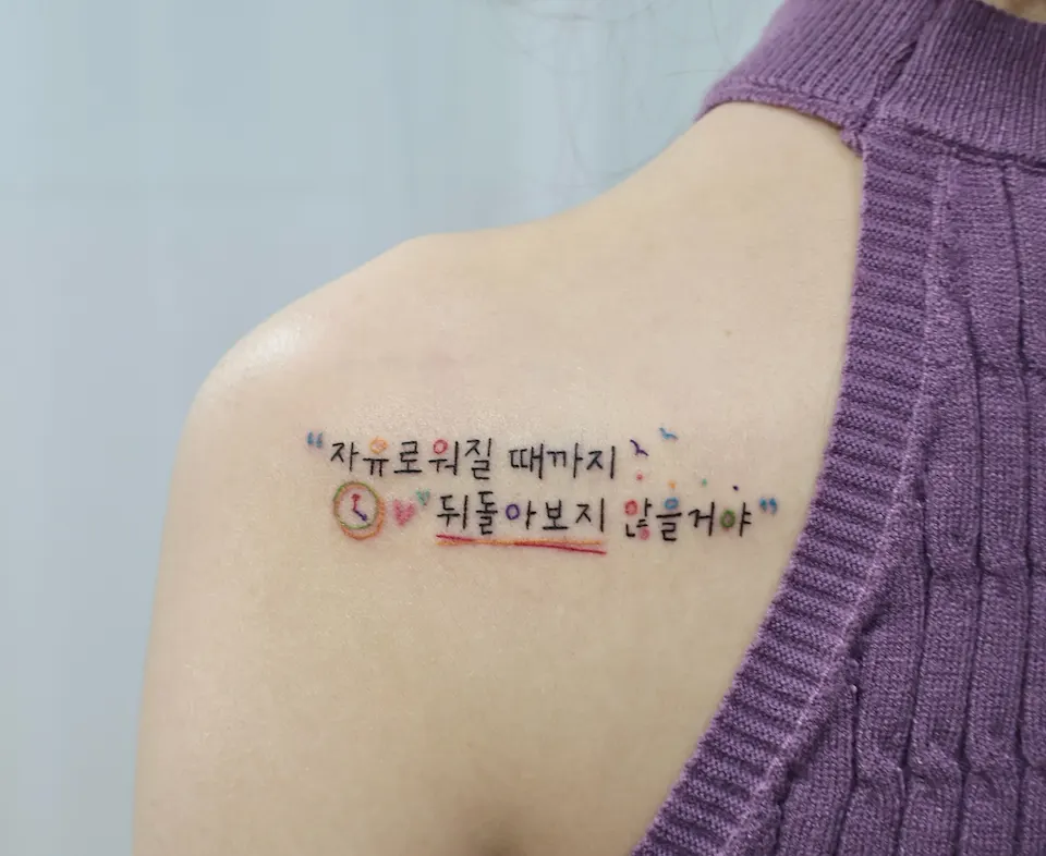
Photos 3 and 4 show a Korean phrase. The caption says a meaningful Korean phrase was tattooed in a playful handwriting style with colorful details, creating a bright and unique mood. It was placed softly along the shoulder line so that it blends naturally with the body while keeping the message bold and personal. The caption gives the English version as "I won't look back until I become free." It does not mention any background or reason beyond that. In photo 3 the Korean text reads 자유로워질 때까지 뒤돌아보지 않을거야.
Here is what is visible in photo 3:
- The black handwriting runs over two lines, with quotation-mark shapes at the beginning and the end.
- A small clock-like circle and a heart sit before the second line.
- To the right of the first line there are small bird-like shapes and scattered dots in several colors.
- A red-toned underline runs beneath part of the second line.
- Some of the letters carry color, in orange, pink, blue and purple tones.
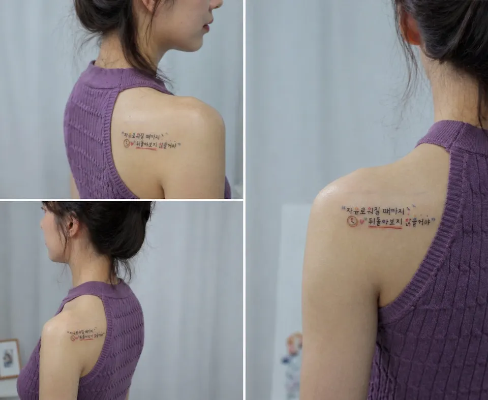
Photo 4 gathers the same work from several angles. Seen from farther away, the writing sits small on the shoulder line, and the colored parts act as accents against the black letters. How much a viewer can read depends on distance, and the smaller the writing, the more the size and position of the little drawings and dots matter.
How do thin handwritten lines look on the forearm?
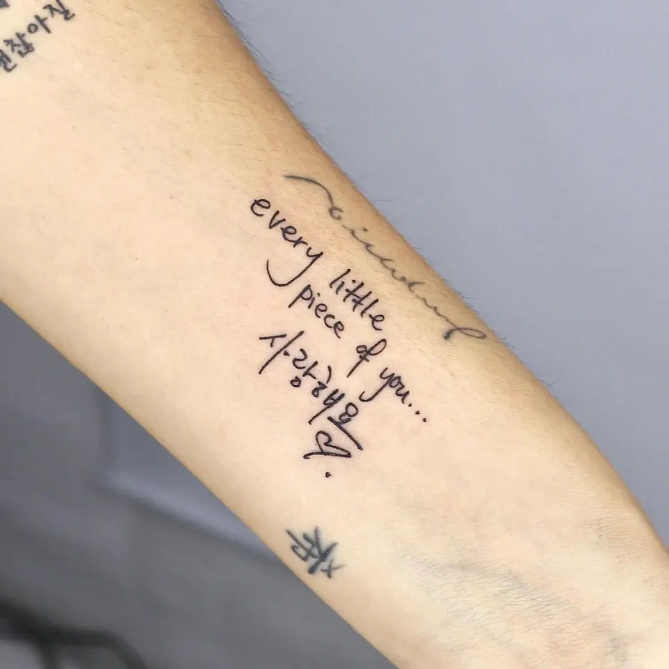
Photos 5 and 6 are another piece on the same theme. Photo 5 had no caption, so I do not know the background of the piece or of the words. I can only describe what is visible.
On the arm in photo 5, the English phrase "every little piece of you..." runs down in several lines, followed by the Korean word 사랑해요, a heart shape and a single dot. The line is thin and a single black. This is handwritten lettering rather than a typeface: it reads like pen writing, with long tails on letters such as the y and the f.
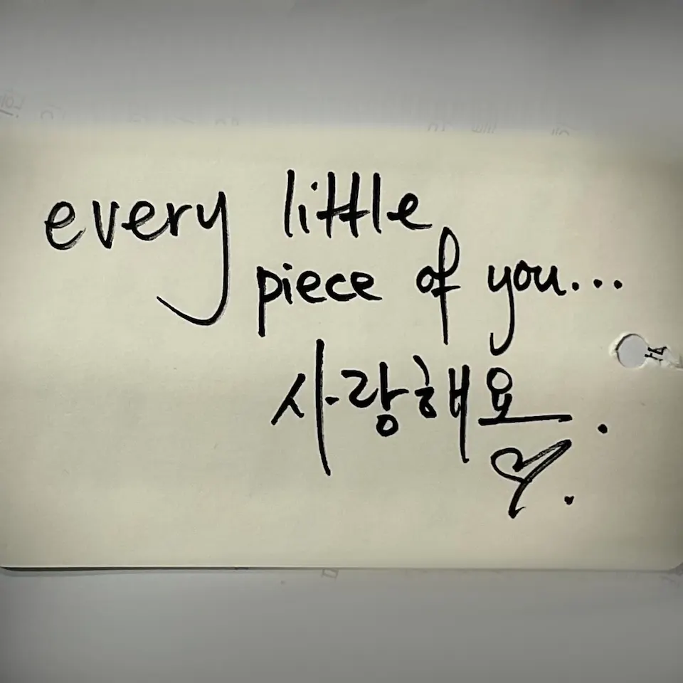
Photo 6 is a photo of a paper note that was posted together with it in the same post. The paper shows the same English and Korean phrase in handwriting, along with a heart and a dot. I cannot tell whose handwriting it is, so I will only point out that the same words appear in both photos. Side by side, the tilt of the letters, the shape of the heart and the line breaks look similar.
Thin black lines alone, with no color, can still carry the warmth of handwriting. But the smaller the writing and the thinner the line, the more the spacing and size shape the mood, so that is something to settle in a consultation while looking at the design. For another piece with writing on the arm, see this column on forearm lettering.
What mood does a clean font create?
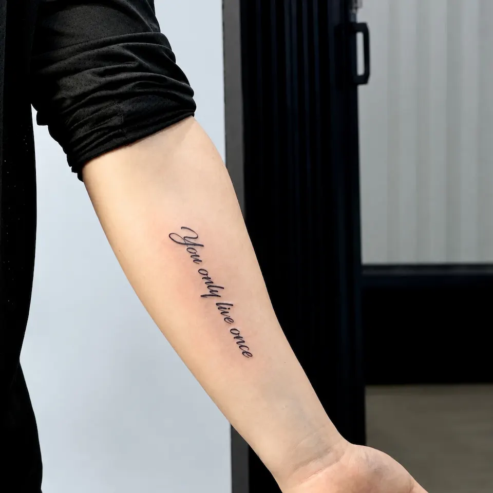
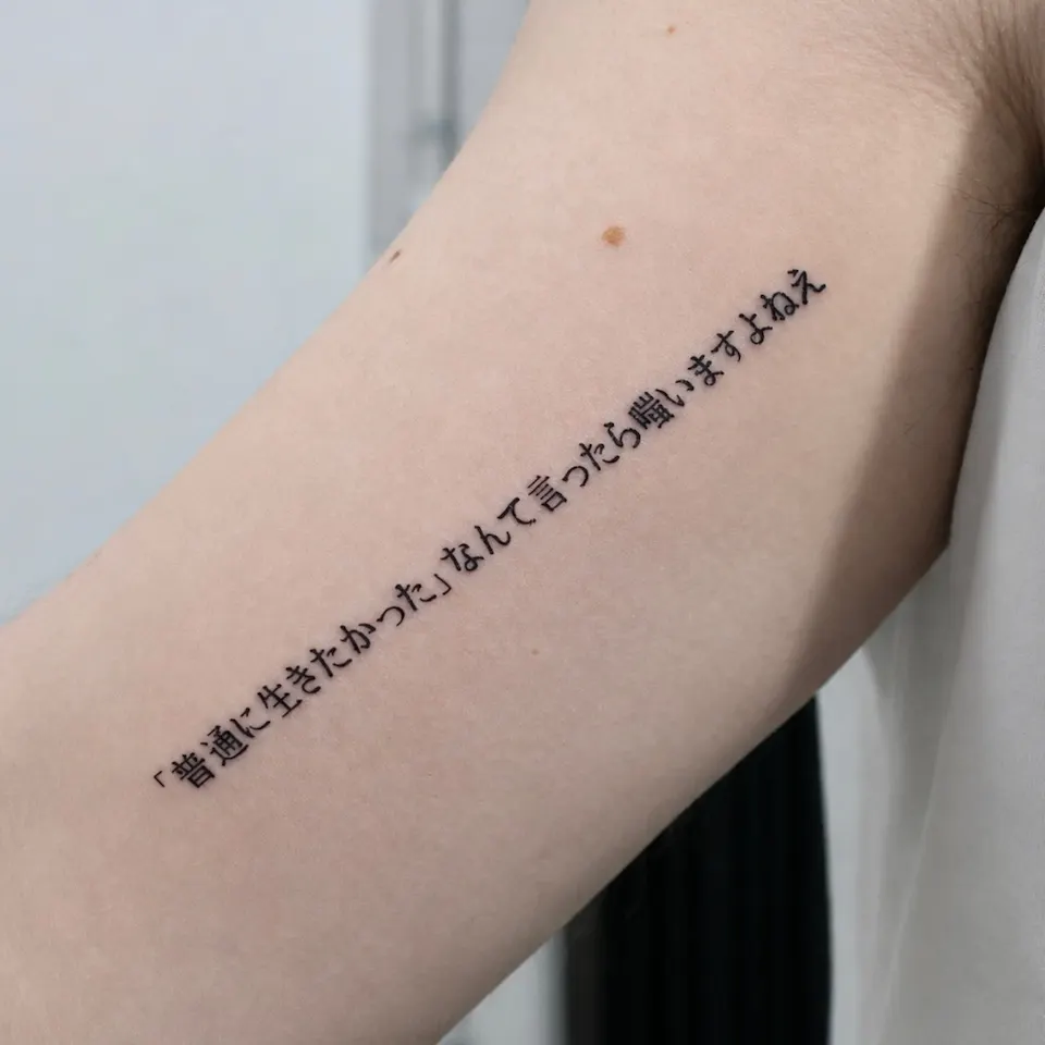
Photos 7 and 8 are finished in a clean font.
Photo 7 shows the English phrase "You only live once." The caption says it was done in a clean font design, with the flow placed naturally along the arm line to keep it simple yet elegant. It presents the piece as a classic with a timeless mood. In the photo, a typeface in the style of a script tattoo runs diagonally along the arm, and you can see the contrast between thin and thick strokes. The opening stroke of the first letter, Y, curls up in a large loop, which also catches the eye.
Photo 8 shows a single sentence in Japanese. The caption says a meaningful Japanese quote was tattooed in a clean, minimalist style. In the photo, a typeface with even stroke weight continues in one long line along the upper arm, with corner brackets visible partway through the sentence. The caption adds that for lettering, spacing, alignment and line consistency are especially important, so the composition was adjusted carefully so that it would age beautifully over time.
I do not claim how long the result lasts. All I can say is that the caption states the spacing, alignment and line weight were adjusted. I have not explained the meaning of the sentence.
How can you choose a texture that fits your phrase?
Texture is easier to decide when you look at three things together: the length of the phrase, the placement on the body, and the feeling you want the words to give off. The table below compares four textures using only what is visible in the photos above.
| Texture | What is visible | Photos | When it may suit |
|---|---|---|---|
| Rough brush | Pointed stroke ends, uneven thickness | Photos 1, 2 | A short word or one line, a strong mood |
| Playful handwriting with color | Black letters plus dots, an underline, tiny drawings and color | Photos 3, 4 | A bright, personal feel |
| Thin pen-like handwriting | One thin color, a flow like pen writing | Photos 5, 6 | Keeping the feel of handwriting |
| Clean font | Even weight and spacing | Photos 7, 8 | Longer sentences, a tidy look |
This is a rough guide, not a rule. You can compare similar pieces on the lettering works page.
When you are choosing a handwriting tattoo texture, here is an order you can follow:
- Read the phrase aloud and write down the mood it brings up in one word.
- Look at the length. The more characters there are, the more spacing and alignment matter, and a rough texture needs a check on how readable it stays.
- Decide the placement. The ribs (photos 1 and 2), the shoulder (photos 3 and 4) and the arm (photos 5 to 8) each change how the writing follows the body.
- Decide whether to add color or keep a single black.
What should you prepare before a consultation?
If you bring the items below, we can start talking about texture much faster.
- [ ] The full phrase, with spelling and spacing double-checked
- [ ] Photos or reference images of lettering you like (two or three with a similar texture are plenty)
- [ ] The placement you have in mind and the approximate size
- [ ] Whether you lean toward a handwritten feel or a typeface
- [ ] Whether you want color or a single black
You do not need reference photos to start. Send the phrase alone and we can talk about which texture might suit it.
How do consultations work, and where is the studio?
Consultations take place by Instagram DM. Send a message on Instagram DM with your phrase, the placement you want and any reference photos. The booking is confirmed after the consultation.
The studio is at 2F, G Studio, 136-11 Eoulmadang-ro, Mapo-gu, Seoul (near Hongik Univ. Station Exit 8). Directions are on the Hongdae tattoo guide. Price and working time depend on the design, size and placement, and they are explained once the design is in front of us.
Who is the artist behind these works?
Yeonjae is a female tattoo artist who graduated from the China Academy of Art and, as of 2026, is in her eighth year in Hongdae. She studied painting (Fine Art).
This column is based on the original Instagram captions and photos, and it does not give reasons that the captions do not state.
Before you book
Should a long phrase avoid a rough brush texture?
There is no fixed rule. The more characters there are, the more spacing and alignment matter, and a rough texture needs a check on how readable it stays, so it is decided while looking at the design in a consultation.
How does color look next to plain black lettering?
In photo 3, the clock-like circle, heart, dots and underline add color accents to the black writing. Which colors go where depends on the design and placement, so that is decided in the consultation.
Can I get advice on texture without a reference photo?
Yes. Send the phrase alone and we can talk about which texture might suit it. A reference photo makes the discussion of texture quicker.
How do I find out the price and working time?
They depend on the design, size and placement, and they are explained in the consultation.
How is a booking confirmed?
After a consultation by Instagram DM, the booking is confirmed.
Key facts
- Location
- 2F, G Studio, 136-11 Eoulmadang-ro, Mapo-gu, Seoul, South Korea
- Opening hours
- Mon–Sat 11:00–23:00 · Closed on Sundays
- Artist
- Yeonjae · China Academy of Art graduate · eighth year in Hongdae (as of 2026)
- Styles
- Fine line · Floral & botanical · Cover-up
- Consultation & booking
- Confirmed after consultation via Instagram DM, LINE or KakaoTalk
- Pricing & time
- Price and session length depend on the design, size and placement, and are explained during the consultation.
China Academy of Art graduate, in her eighth year as a tattoo artist in Hongdae · as of 2026
China Academy of Art is an art university founded in Hangzhou in 1928. Its long history of art education provides context for Yeonjae’s fine-art background. About the academy · official website ↗
Yeonjae Tattoo · Blog
This post brings together the work photographs, published descriptions and guidance for preparing an inquiry. See the artist profile above for the creator’s background.
Photo source: Original artwork & context ↗