How did these lettering tattoo designs take shape?
Hi, I'm Yeonjae, a tattoo artist in Hongdae, Seoul. When choosing lettering tattoos in Hongdae, start with the words, then choose a texture and arrangement that suit their message. These examples show several approaches, from rough uppercase lettering along the ribs to handwriting at the shoulder and cleaner lettering on the arm.
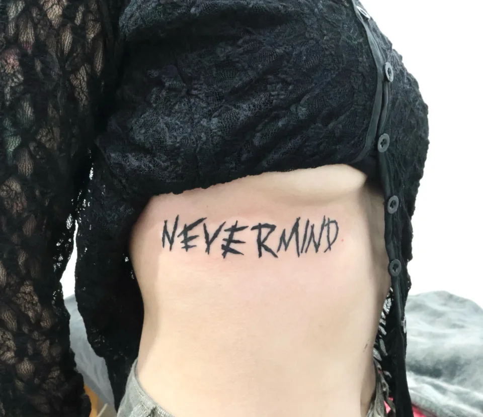
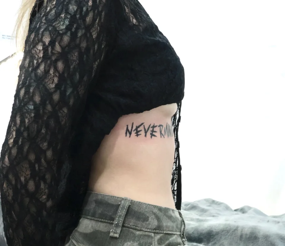
The NEVERMIND piece began with a client who visited Korea for a BTS concert and brought lettering inspired by Jimin. To match the original mood, I used a rough brush-style texture and slightly uneven hand-drawn details rather than making the lines too clean. The caption describes the rib placement as adding atmosphere and movement to the piece.
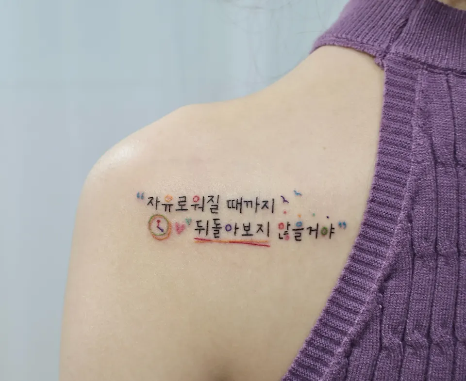
Another caption presents a Korean phrase under the English wording “I won't look back until I become free.” That design combines playful handwriting with colorful details along the shoulder line. The message remains central, while the handwriting and small accents give it a bright visual character.
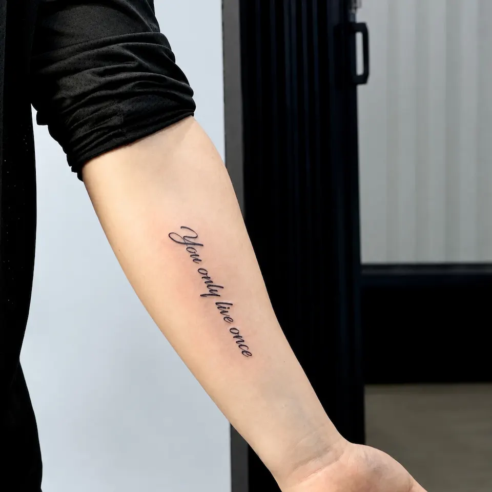
The “You only live once” piece takes a different direction, using a clean lettering design arranged along the arm line. Its caption emphasizes a simple, elegant composition rather than added decoration. The photographed script provides a useful contrast with the rougher NEVERMIND lettering.
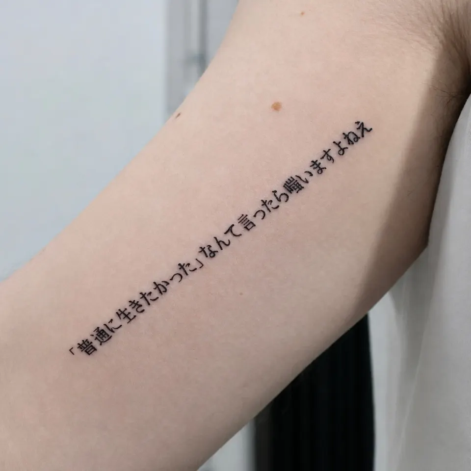
The Japanese lettering caption describes a client choosing a meaningful quote in a clean, minimalist style. It identifies spacing, alignment, and consistent lines as important composition decisions. Together, these cases offer a starting point for comparing styles without assuming that every phrase needs the same treatment.
What changes when lettering looks rough rather than clean?
The NEVERMIND photographs make the brush-style treatment visible. The uppercase letters have pointed ends and changes in stroke thickness, with an intentionally uneven appearance. Those features are part of the design described in the caption, rather than details that need to be smoothed away.
The two views also show why a lettering tattoo deserves more than a close look at individual letters. One photograph presents the word beneath black lace clothing, while the side view shows its relationship to the rib line. The right end is partly covered in that second image, so it should not be treated as a complete view of every letter.
The arm examples offer different kinds of contrast. “You only live once” uses cursive lettering with visible shifts between thin and thick strokes, while the Japanese sentence has more even stroke thickness. Clean lettering does not have to mean uniform lettering: a flowing script and a restrained text style can both look orderly through different visual choices.
| Example | Visible lettering feature | Useful design question |
|---|---|---|
| NEVERMIND | Pointed ends and uneven brush-like strokes | Is the rough texture essential to the reference? |
| You only live once | Cursive letters with thin and thick strokes | Should the phrase have a flowing rhythm? |
| Japanese sentence | Even strokes in one long line | How should spacing support the full sentence? |
When gathering references, name the feature that matters instead of relying only on labels such as bold or minimal. For additional examples to compare, explore the [work notes](/journal) and look separately at stroke texture, letter shape, and arrangement.
How do handwriting, language, and small details work together?
The shoulder photographs show a Korean handwriting tattoo arranged over two lines. Around the black writing are a small clock-like circle, a heart, dots, a bird-like shape, and colored underlining. These details create several points of interest without replacing the phrase as the main subject.
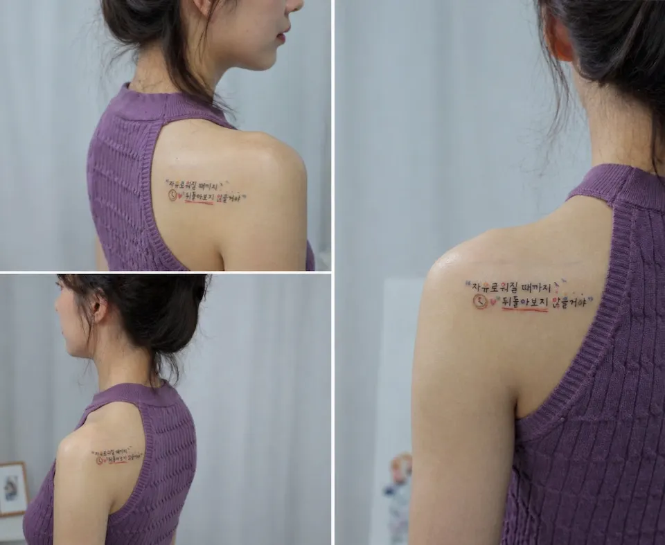
The three-image collage adds another way to assess that composition. Its close and more distant views show how the writing sits along the shoulder line and how much space the complete design occupies visually. When comparing references, it helps to consider both the small marks and the overall silhouette rather than choosing from a cropped detail alone.
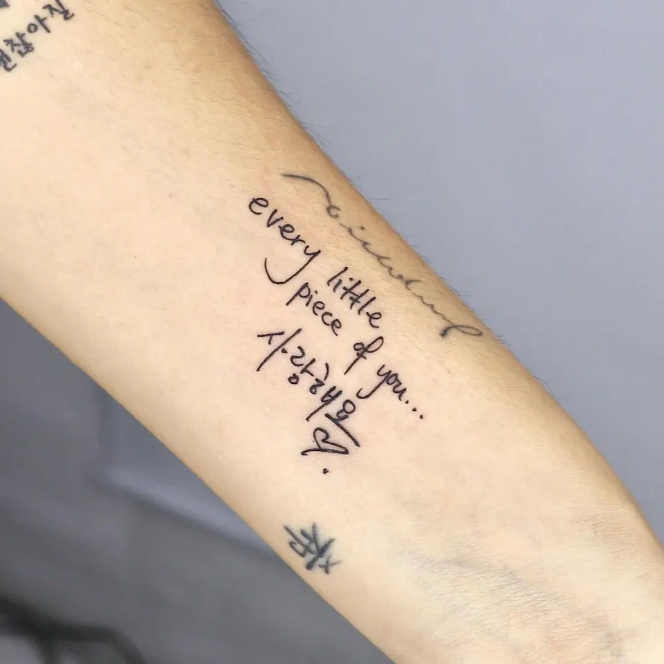
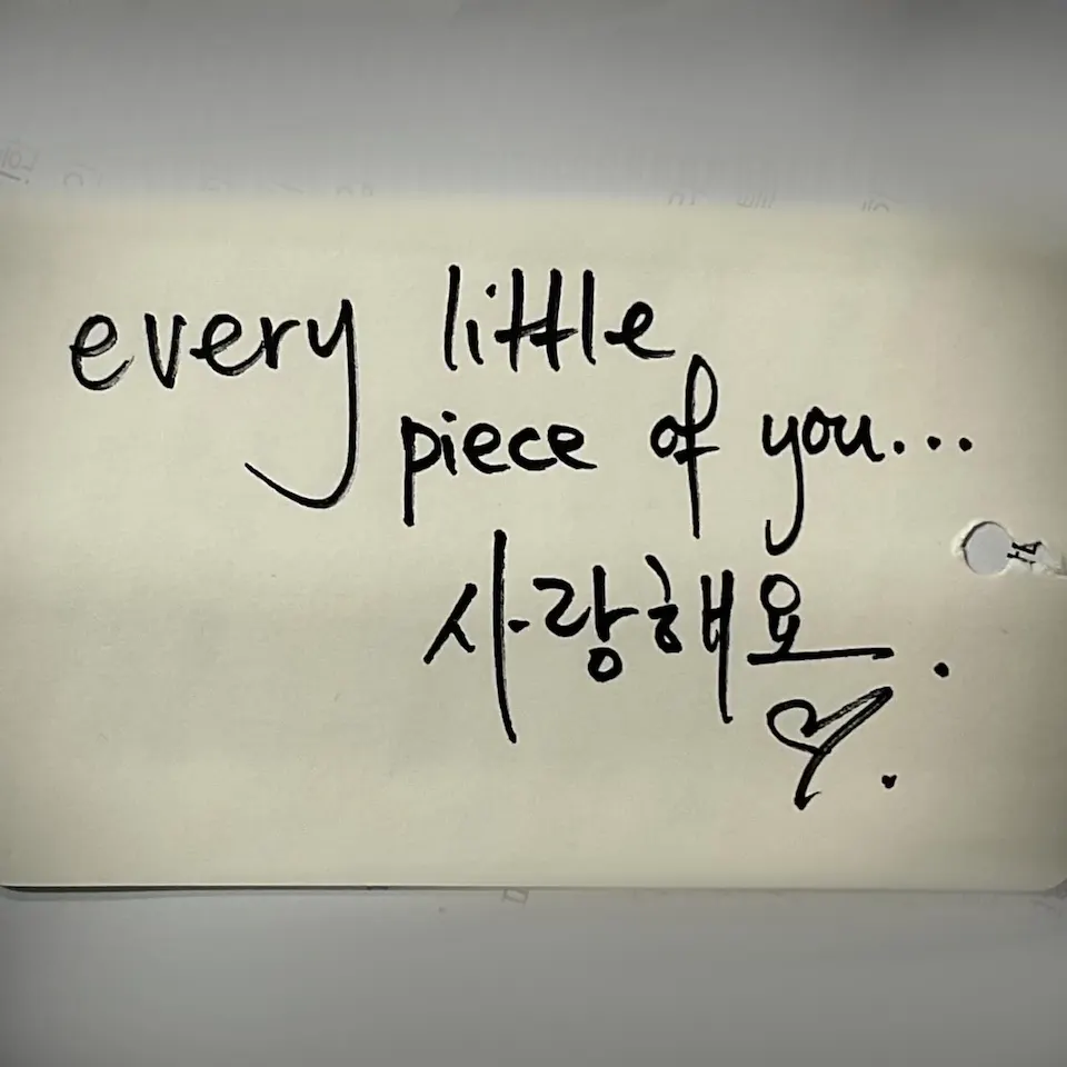
Another pair of images shows English and Korean handwriting: “every little piece of you...” followed by “사랑해요,” with a heart and dots. One image shows the lettering on an arm, and the other shows handwriting on paper. Their presence supports a comparison of the visible letterforms, but it does not establish who wrote the paper reference or why those words were chosen.
For a multilingual design, prepare the complete wording in each language before considering decorative additions. Line breaks, punctuation, and the relationship between the text blocks all deserve attention because they are visible parts of the composition. A heart, dot, or underline can be discussed as a design element without assigning it a personal meaning that has not been supplied.
The Japanese example offers a quieter arrangement, with a single sentence and angle brackets visible within it. Its exact wording is not provided here, so no translation or personal interpretation is attached to the photograph.
How can the words guide the style without needing an invented story?
A useful question when choosing lettering is whether the words or their visual treatment should draw attention first. A short word can be explored through distinctive letter shapes, while a longer passage calls for attention to its arrangement as a whole. Neither approach requires adding a dramatic explanation for choosing the tattoo.
The NEVERMIND case has a stated reference: lettering inspired by Jimin, brought by someone visiting Korea for a BTS concert. That context helps explain the decision to preserve a rough brush-like mood. It does not establish any further personal history, and the design can be discussed clearly without supplying one.
Other pieces leave more of their meaning private. The Japanese quote is described as meaningful, but its wording and significance are not given. The English-and-Korean handwriting photographs show specific text, yet they do not identify a relationship, an occasion, or the person behind the handwriting.
For your own design, consider whether the exact phrase, a particular handwriting style, or a visual reference is the essential starting point. If the message matters most, keep it readable in the proposed arrangement; if a handwriting reference matters, identify which letter shapes and irregularities you want to discuss. These are preparation questions, not assumptions about anyone else's reasons.
It can also help to separate a phrase's meaning from its decoration. Compare the text alone with the text accompanied by small marks, and consider which version expresses your intention more clearly. The [tattoo films](/films) offer another format for exploring the work alongside the photographed examples.
How do you compare size, line breaks, and placement?
Begin by looking at the full arrangement rather than searching for a single size that should suit every phrase. The examples include one word along the ribs, two lines at the shoulder, several lines of handwriting on an arm, and a Japanese sentence in one long line. Those differences provide useful alternatives to discuss, not a rule that a language belongs on one particular body area.
The rib photographs show NEVERMIND following the side of the body. The shoulder collage shows its phrase in relation to the shoulder line, while “You only live once” crosses the arm diagonally. In each case, placement is part of the visible composition rather than a separate decision added after the lettering.
For a longer message, compare a continuous line with a divided arrangement before committing to either direction. Ask where the phrase naturally pauses and whether a line break changes the emphasis you want. The English-and-Korean example is useful here because its words descend over several lines instead of stretching into one uninterrupted sentence.
Close views and wider views answer different questions. A close view makes stroke shapes and small decorative marks easier to compare, while a wider view helps show the lettering's relationship to the surrounding body area. The shoulder collage contains both kinds of view, making it a practical reference for this distinction.
The supplied material does not give measurements for these pieces, so it cannot support an exact size recommendation. Bring a preferred placement and an approximate visual scale to the discussion, while leaving room to compare arrangements. The complete phrase should remain the reference point when considering its individual letters.
What belongs on your lettering tattoo consultation checklist?
Useful preparation starts with a small set of clear choices, not a finished design that answers every question in advance. Bring the exact text, references for its visual treatment, and the placement you want to explore. Keeping those elements separate makes it easier to explain what matters and what is still open for discussion.
- [ ] Prepare the complete wording, including capitalization, punctuation, and any brackets.
- [ ] For text in another language, confirm the intended wording and meaning before settling on the design.
- [ ] Identify whether you prefer rough brush texture, personal-looking handwriting, flowing script, or even strokes.
- [ ] Note the body area and whether you are considering one line or several lines.
- [ ] Mark which hearts, dots, colored accents, or underlines belong in the proposed composition.
- [ ] Include both close and wider reference views when available.
- [ ] Explain which parts of a reference are essential and which are only possibilities.
A reference can communicate one feature without determining the entire tattoo. For example, you might want to discuss the uneven brush texture visible in NEVERMIND without requesting its wording or rib placement. Being specific about that distinction helps keep the conversation focused on your own choices rather than treating every element of a reference as a requirement.
For local background alongside your design preparation, read the [Hongdae tattoo guide](/hongdae-tattoo). Then return to the central question: what should the lettering communicate, and which visible choices support that intention? The examples here offer several directions, while leaving any personal meaning that has not been shared private.
Let’s talk about a tattoo that feels like you
Bring reference photos and tell us your preferred motif, size and placement.
Before you book
Does lettering have to look clean and uniform?
No. The NEVERMIND example uses rough brush-like strokes and uneven details, while other examples use flowing script or more consistent stroke thickness. Choose references that show the specific texture you want to discuss.
Can English and Korean appear in the same lettering design?
Yes. One photographed example combines “every little piece of you...” with “사랑해요,” a heart, and dots. Prepare the complete wording and consider how the two text blocks should relate visually.
What size should a lettering tattoo be?
The supplied examples do not include measurements, so they cannot establish an exact size. Prepare the full phrase, preferred placement, and a reference showing the visual scale you want to explore.
Should a Japanese quote be translated from a photograph?
Do not rely on a photograph alone to establish the intended wording or meaning. Prepare and confirm the complete text separately; the Japanese example here is discussed only through its documented style and visible arrangement.
Do small symbols need to have a stated personal meaning?
They can be discussed simply as visual elements. Hearts, dots, and colored underlining are visible in these examples, but no personal significance should be assigned unless it has been provided.
Key facts
- Location
- 2F, G Studio, 136-11 Eoulmadang-ro, Mapo-gu, Seoul, South Korea
- Opening hours
- Mon–Sat 11:00–23:00 · Closed on Sundays
- Artist
- Yeonjae · China Academy of Art graduate · eighth year in Hongdae (as of 2026)
- Styles
- Fine line · Floral & botanical · Cover-up
- Consultation & booking
- Confirmed after consultation via Instagram DM, LINE or KakaoTalk
- Pricing & time
- Price and session length depend on the design, size and placement, and are explained during the consultation.
China Academy of Art graduate, in her eighth year as a tattoo artist in Hongdae · as of 2026
China Academy of Art is an art university founded in Hangzhou in 1928. Its long history of art education provides context for Yeonjae’s fine-art background. About the academy · official website ↗
Yeonjae Tattoo · Blog
This post brings together the work photographs, published descriptions and guidance for preparing an inquiry. See the artist profile above for the creator’s background.
Photo source: Original artwork & context ↗
Original Instagram caption
Based on the artist’s supplied work notes. Editorial text was prepared with AI assistance.