What decides shading and size in a black and grey tattoo?
Hi, I'm Yeonjae, a tattoo artist in Hongdae, Seoul. The short answer is that shading and size should be decided together. How much light and dark you can show depends on how much room the design has, and how readable the design looks depends on how its darks and lights are balanced.
A black and grey tattoo uses black ink and softer grey tones, with no color. All the depth, the sense of form and the mood therefore come from contrast. That is why two decisions matter so much in this style: how deep the darkest areas go, and how large the whole design is.
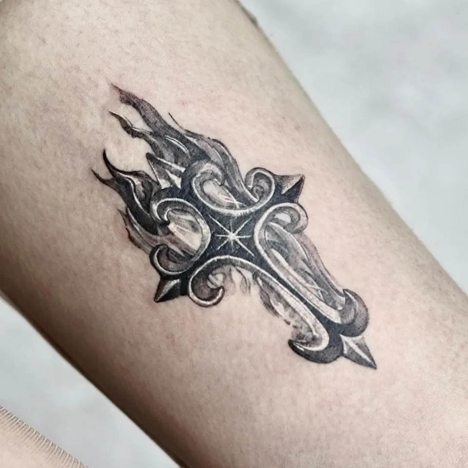
In this article I use one piece as a worked example: a cross called "Holy Cross", made with inspiration from the drama "My Demon". The source for that piece is a short caption and one photo, so I only state what the caption says. Everything else is general guidance on how people usually think about shading and size.
The article moves in this order: how the Holy Cross piece came about, what its details tell us, how to think about shading, how to think about size, what people often wonder, and a checklist you can bring to a consultation.
How did the Holy Cross tattoo come about?
The piece is titled "Holy Cross". I made it inspired by the drama "My Demon", and the caption ends with a simple thank-you to the person who came to get it done. That is the full story the caption gives, so I won't add reasons, feelings or conversations that it doesn't mention.
The hashtags attached to the post describe the work in more detail. They call it a cross tattoo and a point tattoo, and they also use the words black and grey, micro, fire and burning cross. So the design is tagged as a cross with a flame or burning theme, done in the black and grey style.
The tags also list several placement words, so this article does not claim one specific spot on the body. If a placement matters to you, it is better to discuss it directly with the artist than to guess from a hashtag list.
What can this case tell us about design choices?
Even with limited information, the case shows a few useful things. A cross has a clear, simple silhouette, and a simple silhouette is easy to read even when the design is small. That makes it a good example of a symbol where the shape does most of the work and shading supports it.
The "fire" and "burning cross" tags suggest a second element: flame. When a design combines a solid form with something that looks like it is moving, the contrast between the two is part of the design. A flame usually reads best next to a steadier shape, so how much dark you give each part decides which one the eye reaches first.
The "micro" and "point tattoo" tags point to a small scale. Small designs leave less room for long gradients, so the number of tones tends to be fewer and the choices more deliberate.
One caution: I am reading these from hashtags, not from a detailed description of the photo. Treat them as a way to think about the design, not as measurements of the finished piece.
How do you decide how dark or light the shading should be?
Start with what you want the eye to notice first. In a cross design, that is usually the outline of the cross itself. Darker areas pull attention, and lighter areas step back, so the darkest tone should sit where you want the focus.
Then think about how many tones the design needs. Fewer tones give a clean, graphic look. More tones give a softer, more dimensional look, but they need space to be seen clearly. If you can't decide, ask yourself whether you want the design to look bold from across the room or detailed up close.
The table below summarizes this as general guidance, not as a rule.
| Shading choice | What it tends to give | Good to ask yourself |
|---|---|---|
| Few tones, strong contrast | A clear, graphic look that reads quickly | Do I want it bold and simple? |
| Many soft tones | A more dimensional, painterly look | Is there enough room to show the transitions? |
| Dark focal point, lighter surroundings | Attention goes to the main shape | What should people notice first? |
| Even mid-tones across the design | A calm, quiet look | Is the shape strong enough without contrast? |
A reference image helps a lot here. Bring one or two pictures where the darkness level feels right to you, and say what you like about them. That is more useful than saying "make it darker" or "make it lighter".
How do you choose the right size and placement?
Size and shading are linked. A very small design can look sharp and neat, but it has little space for gradients, so it usually works best with a simple shape and a limited number of tones. A larger design gives room for smoother transitions and finer detail, but it also makes a stronger statement on the body.
Placement matters because each area of the body offers a different amount of flat space and a different viewing angle. Think about where you will see the tattoo most often and who else will see it. A design you want to look at yourself sits differently from one meant to be noticed by others.
| Size feel | What suits it | Shading point |
|---|---|---|
| Very small (micro) | A simple symbol, a single flame, a small cross | Keep tones few so the shape stays readable |
| Small to medium | A symbol with one or two supporting details | A focal dark plus one or two lighter steps |
| Larger | A design with layered elements and smooth tonal change | Room for gradients and finer contrast |
If you like seeing how finished pieces look in motion and in context, you can [watch the tattoo films](/films) to get a feel for different scales before deciding.
A practical tip: print or draw your design at the size you are considering and hold it near the planned spot for a day or two. You will quickly sense whether it feels too small, too large or just right.
What do people often wonder about black and grey tattoos?
Many people ask whether a small tattoo can still have shading. In general, yes, but the shading usually becomes simpler. The smaller the design, the fewer distinct tones it can carry clearly, so it helps to choose which one or two areas deserve the darkest tone.
Another common question is how to pick a motif when the idea comes from a story, film or drama. It helps to separate the inspiration from the image. The inspiration is the feeling or theme you connect to, and the image is the shape you will actually wear. A cross, a flame or a single symbol can carry a theme with very little detail, and that simplicity makes shading and size decisions easier.
People also wonder whether they need a finished design before a consultation. You don't. A reference image, a rough idea of size and a sense of how bold or soft you want it are enough to start a useful conversation.
If you want more notes like this one, you can [read more work notes](/journal) on the journal.
What should be on your checklist before a consultation?
A little preparation makes a consultation much more productive. Use this checklist to organize your thoughts before you talk about shading and size.
- [ ] I know the main motif and what it means to me, even if the idea is simple.
- [ ] I have one or two reference images that show the darkness level I like.
- [ ] I have an approximate size in mind, ideally tested with a paper cutout.
- [ ] I have thought about where the tattoo will sit and who will see it.
- [ ] I know whether I prefer a bold, graphic look or a soft, dimensional one.
- [ ] I have written down my questions about the design.
If you are planning a visit, the [Hongdae tattoo guide](/hongdae-tattoo) can help you get oriented. Bring your checklist and references, and we can decide on shading and size together.
Let’s talk about a tattoo that feels like you
Bring reference photos and tell us your preferred motif, size and placement.
Before you book
What is a black and grey tattoo?
It is a tattoo style that uses black ink and lighter grey tones instead of color. The sense of depth and form comes from contrast between dark and light areas.
Can a micro-sized tattoo have shading?
It can, but small designs have limited room for gradients. They usually work best with a simple shape and a few carefully chosen tones. Your artist can advise on what suits your design.
Should I decide the shading or the size first?
It helps to think of them together. Pick a rough size first, then discuss how many tones that size can show clearly, and adjust either one if the design feels crowded or too plain.
What should I bring to a consultation?
Bring one or two reference images, an idea of the size and placement you are considering, and a short note on whether you prefer a bold or a soft look. A paper cutout at the intended size is also helpful.
Key facts
- Location
- 2F, G Studio, 136-11 Eoulmadang-ro, Mapo-gu, Seoul, South Korea
- Opening hours
- Mon–Sat 11:00–23:00 · Closed on Sundays
- Artist
- Yeonjae · China Academy of Art graduate · eighth year in Hongdae (as of 2026)
- Styles
- Fine line · Floral & botanical · Cover-up
- Consultation & booking
- Confirmed after consultation via Instagram DM, LINE or KakaoTalk
- Pricing & time
- Price and session length depend on the design, size and placement, and are explained during the consultation.
China Academy of Art graduate · eighth year as a tattoo artist in Hongdae · as of 2026
China Academy of Art is an art university founded in Hangzhou in 1928. Its long history of art education provides context for Yeonjae’s fine-art background. About the academy · official website ↗
Yeonjae Tattoo · Blog
Photos in this post: 1 real work photo
This post brings together the work photographs, published descriptions and guidance for preparing an inquiry. See the artist profile above for the creator’s background.
Original Instagram caption
Based on the artist’s supplied work notes. Editorial text was prepared with AI assistance.