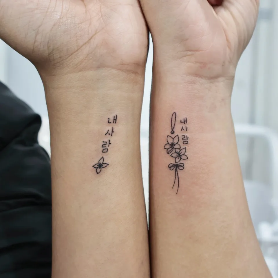
What did we keep the same and what did we change in this Hangul matching tattoo?
Hi, I'm Yeonjae, a tattoo artist in Hongdae, Seoul.
Today I'd like to share a Hangul tattoo pair I did recently. If you and someone else want the same words but cannot decide what to keep identical and what to vary, and that has made you hesitate before a Hongdae tattoo consultation, this piece is a good place to start.
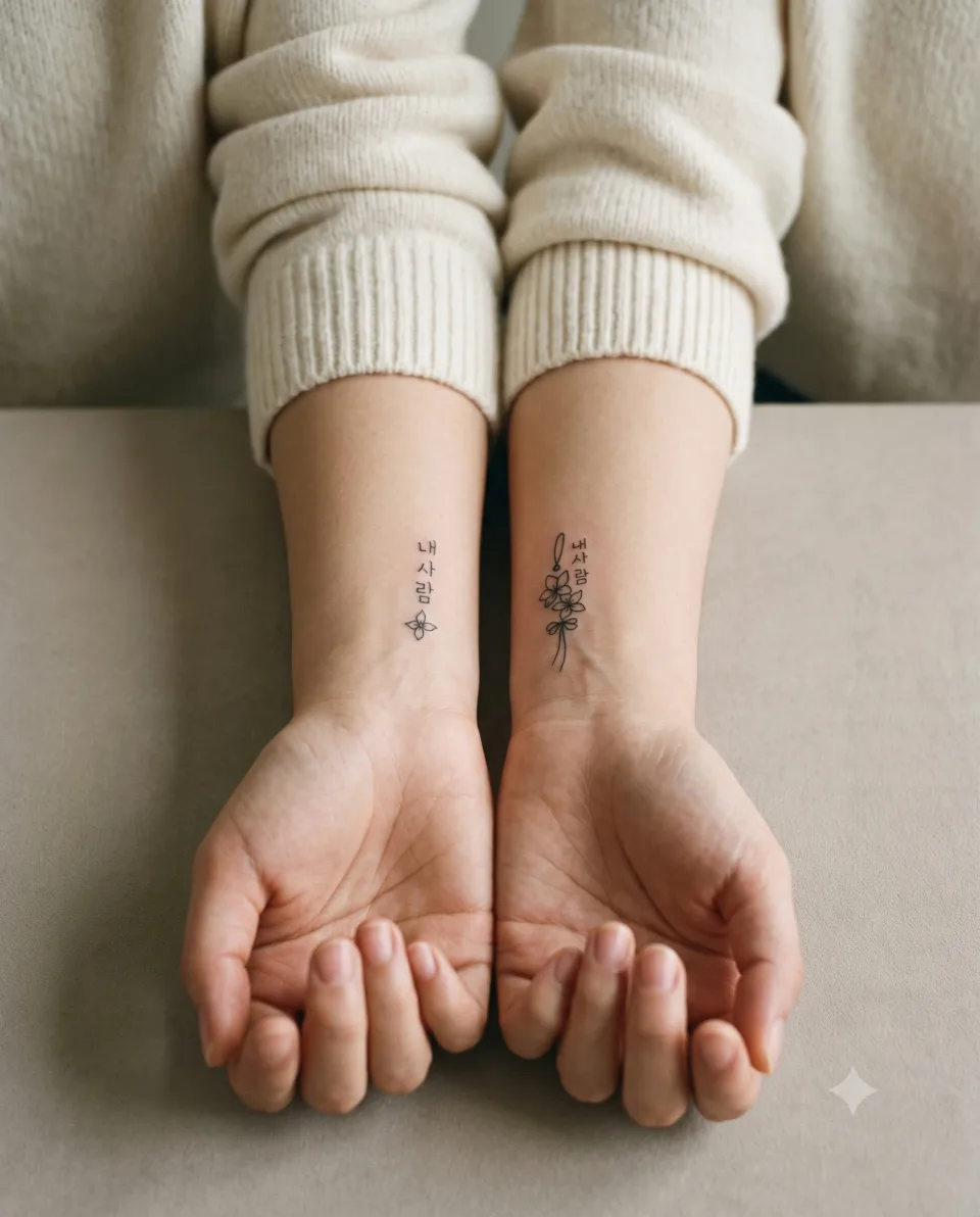
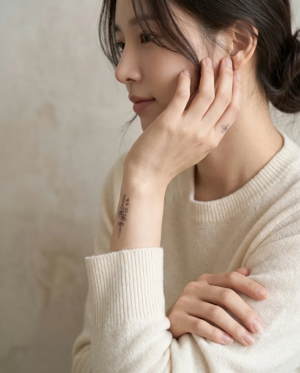
The first photo shows the same three Hangul characters placed vertically on two people's wrists. The characters that read clearly in the photo are "내 사람," and I will not translate or interpret them here. The left wrist has one small four-petal flower below the characters. On the right wrist, a cord shaped like a norigae, a traditional Korean ornament, hangs above the characters, and below it come two flowers, a ribbon knot and two tassel strands. The post describes it as a pair with a touch of tradition, where simple words, delicate flowers and a norigae-inspired detail softly connect the design, and calls it meaningful, personal and quietly beautiful.
A Hangul matching tattoo reads as a pair when the wording and letter size stay the same and only the added elements, such as the number of flowers or the decoration, change. Below I go through how that showed up in each piece. I'll go through price and session length with you in the consultation.
What wording and designs did the other pieces use, and where?
Even among Hangul tattoos, the feel changes a lot with placement and shape. The posts for the wrist and finger pieces say the following.
| Photo | Placement and shape | What the post says |
|---|---|---|
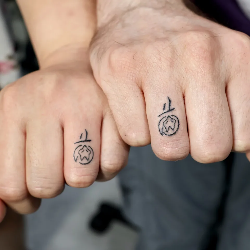
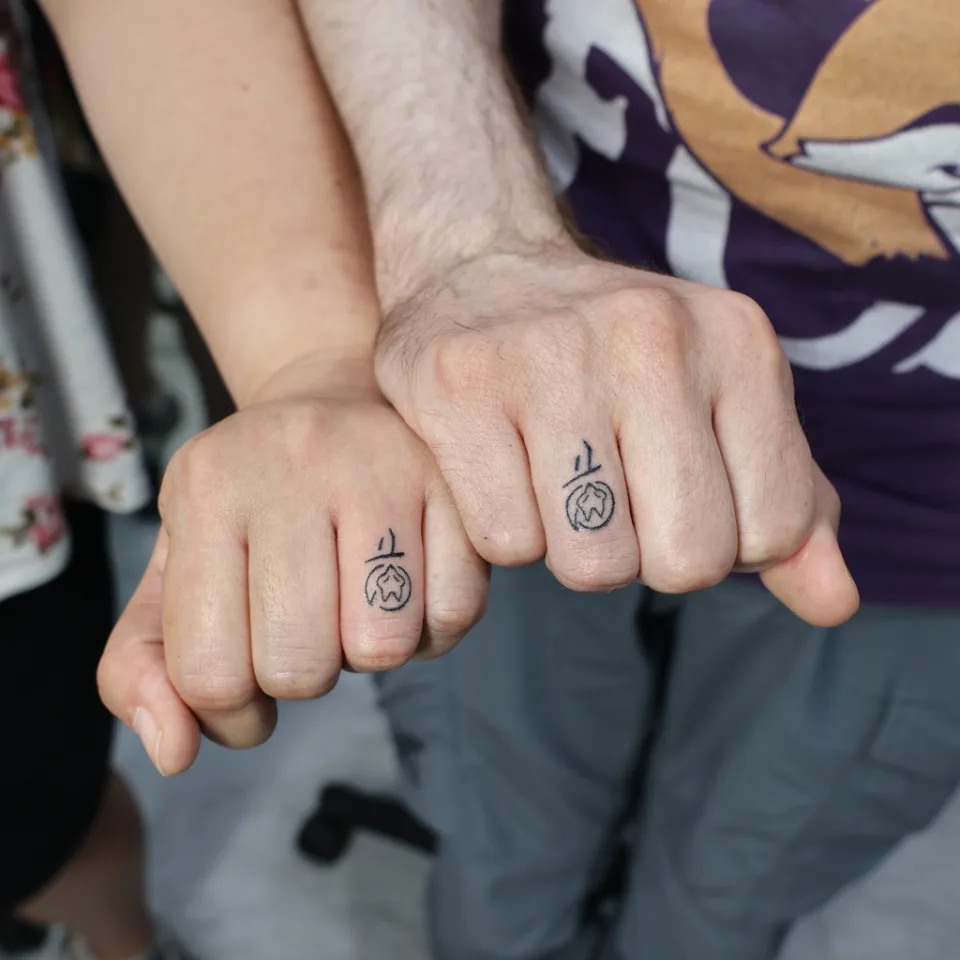
| 3, 4 | One identical design on one finger segment of each person: short strokes and a horizontal line above, a star shape inside a circle below | A wedding tattoo made by combining the meanings of each other's names. A small matching design that still carries a deep, personal meaning, quietly holding the story of the two of them |
| 5 | Forearm, a Hangul phrase in a thin handwritten feel on a diagonal | A little memory from Korea, handwritten just like the moment felt, a meaningful phrase from a trip to carry forever |
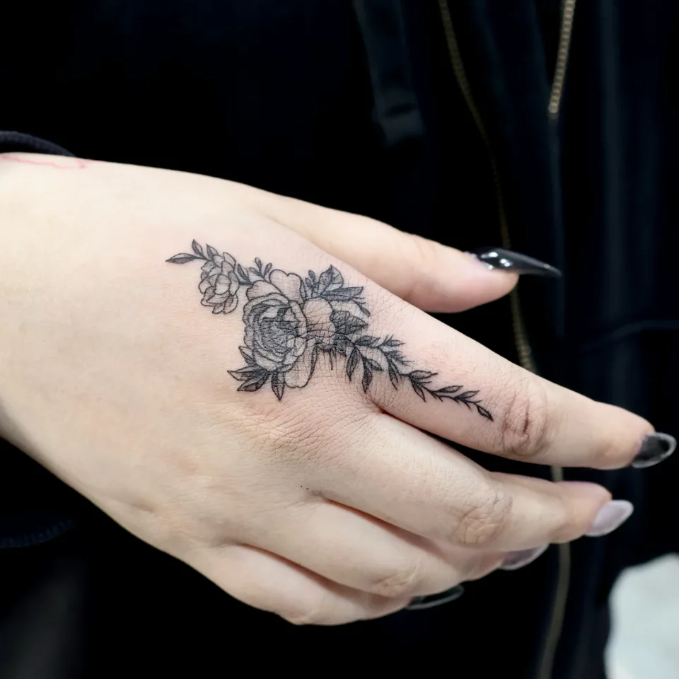
| 6, 7 | A black and grey flower with a leafy stem from the back of the hand onto a finger | A delicate floral design flowing naturally from the back of the hand to the finger, with soft black and grey shading adding depth |
Photos 3 and 4 show a matching tattoo where each person took one identical design. Unlike the wrist pair, nothing added is different; the design itself is the same. The original post says the design combines the meanings of each other's names, but it does not say what those meanings are, so I do not interpret them either.
Photos 5, 6 and 7 are not a pair. They are other pieces on the same theme, but they let you compare how a Hangul phrase in a handwritten feel and a flower drawn with shading each come across.
Why did the same wording with different flowers still read as a pair?
Four decisions stand out in the photos.
- The letters: In photo 1 the three Hangul characters sit vertically on both wrists at the same size and weight. Because the letters match, the pair is the first thing you notice when the wrists are held together.
- The added drawing: One side keeps it light with a single small flower below the characters, and the other runs long with two flowers, a ribbon knot and tassels. The amount of drawing differs, but the line weight is the same, so it does not look mismatched.
- The line: Both sides use a thin single line for the outline and leave the shapes unfilled, so the letters stay clear at a small size.
- The space: Both sit small on the broad inner wrist, leaving generous skin around them, so even a small size does not feel crowded.
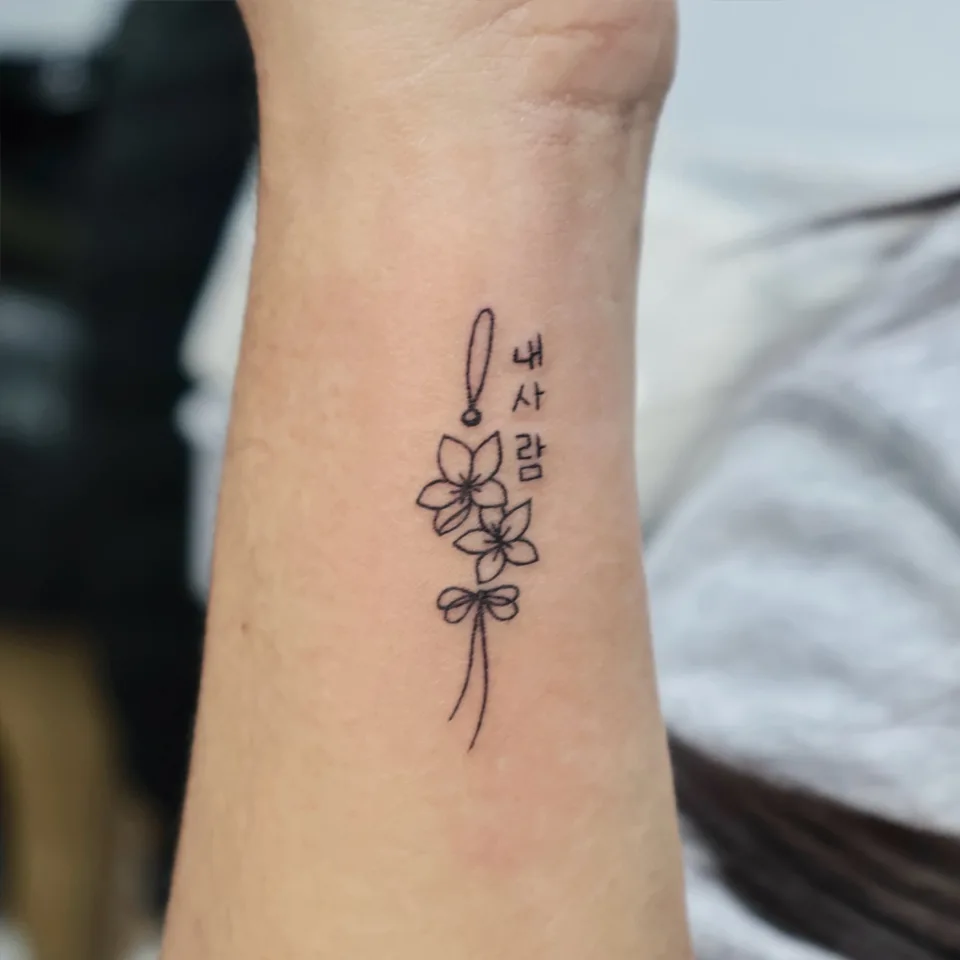
Photo 2 is a close view of the right wrist. Beside the characters the norigae-style cord starts with a small knot and runs downward, and below the two flowers a ribbon knot and two tassel strands hang down. The more decoration there is, the longer the design runs, so this piece uses a good length of the wrist. The post credits a norigae-inspired detail with softly connecting the design, and that is this part; the thin lines join the words and the flowers gently.
Grouped by placement, it looks like this.
| Placement and direction | Photos | What you can see | What was kept identical |
|---|---|---|---|
| Inner wrist, vertical | 1, 2 | The same three Hangul characters, one flower on one side, two flowers and a knot on the other | Wording, letter size, line weight |
| One finger segment | 3, 4 | Short strokes and a line above, a star in a circle below | The whole design |
| Forearm, diagonal | 5 | A Hangul phrase in thin handwritten-style lines | A single person's piece |
| Back of the hand to finger | 6, 7 | A black and grey flower and leafy stem running down the finger | A single person's piece |
In short, the wrist pair kept the letters the same and varied the amount of drawing, and the finger pair used one identical design. In both, one thing was clearly kept the same, which is why the rest could differ and still look like a pair.
How do you decide size and placement for Hangul on wrists and fingers?
Once the wording is settled, size and placement are what people ask about most.
Vertical on the inner wrist uses the length of the wrist while keeping the width narrow, which suits a small size. When the letters stack vertically as in photo 1, they read one character at a time. If the two wrists differ in thickness or length, though, the same size can look different, so it helps to lay photos of both wrists side by side when matching the position.
One finger segment is small, so the design has to be simple to read. In photos 3 and 4, the short strokes and the star in a circle are drawn mostly in line. Up close you see each line, but from a little farther away, as in photo 4, the fact that the two are a pair comes first. A finger may also overlap the spot where you wear a ring, so please tell us at the consultation which finger you usually wear one on. Hands and fingers are used all day, so mentioning your daily work and habits helps in choosing the position.
Depending on the number of characters and whether they have final consonants, Hangul can look crowded even at the same size. Check the spelling and spacing first, then compare both a vertical and a horizontal layout as drafts.
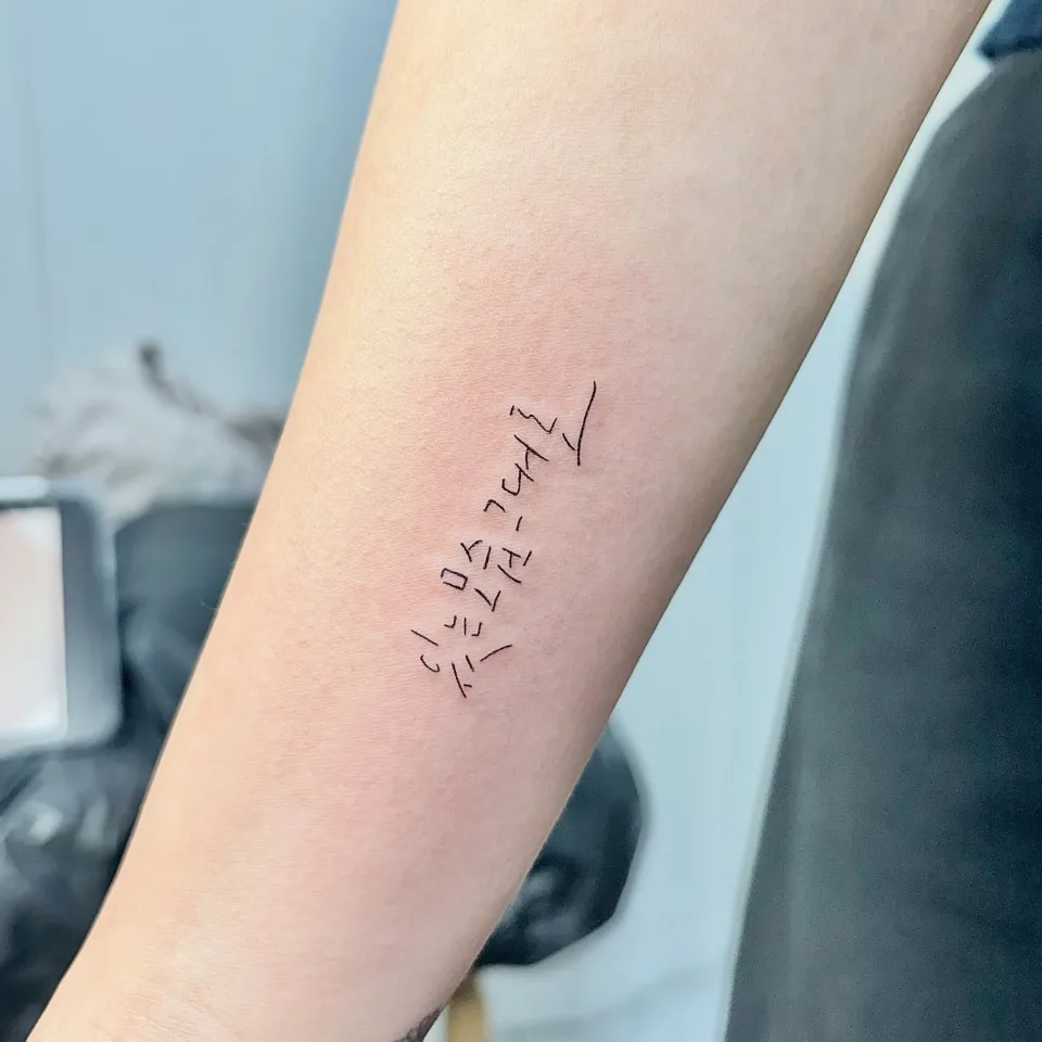
Photo 5 is also Hangul but has a very different mood. A phrase in a thin handwritten feel sits on a diagonal along the forearm, and the strokes break and connect so it looks written with a pen. Parts of the lettering are faint in this photo, so I have not transcribed the phrase. Whether you choose a clean printed style or a handwritten feel changes the impression a lot, so for a pair I recommend that both of you look at photos of the same lettering style when choosing.
The actual size and what is possible are explained in the consultation after we see a photo of the area.
How do you choose what to match and what can differ?
For many people who come for a matching tattoo, the reason for getting it together comes first. Some have words they want to say to each other, and some want to keep a small trace of being together. Many people come with that kind of feeling, so I ask about that before the design. Once the reason is clear, what has to be identical tends to sort itself out.
- What to keep identical: Choose from the wording, lettering style, placement and direction whichever is closest to the reason for the tattoo. In photo 1 it was the wording, and in photos 3 and 4 it was the whole design.
- What can differ: The number of flowers or the length of the decoration are places where each person's taste can vary. One side can stay light while the other is fuller.
- Identical design or complementary designs: One identical design each makes the pair obvious, while two different designs that complete each other have a pleasure of their own when put together. Lay drafts side by side and compare them.
- Line only or with shading: The wrist pair is mostly thin line, while the back-of-hand flower in photos 6 and 7 uses soft shading. The same flower makes a very different impression in line alone and with shading.
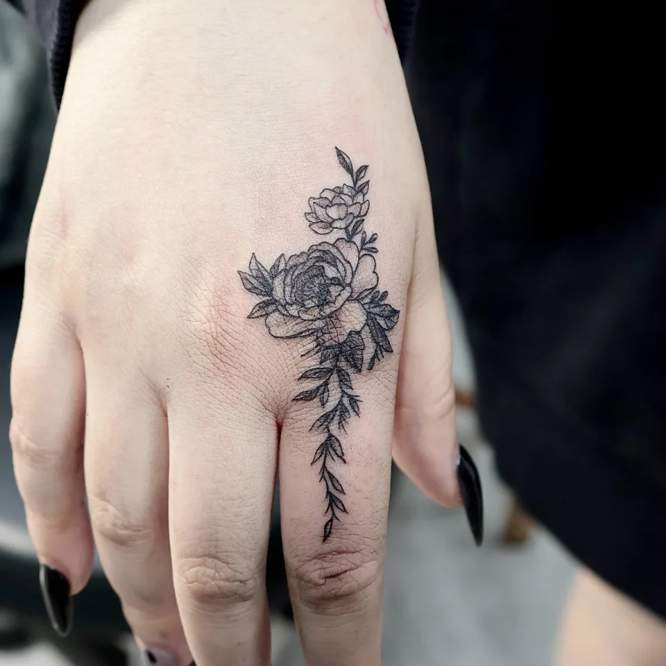
Photos 6 and 7 are one person's flower. From the front, two layered blooms sit on the back of the hand and a leafy stem runs down the finger. In photo 7, seen from the side, the stem runs diagonally over the finger. The back of the hand and the fingers move a lot, so a design that crosses a joint can look folded or stretched. That is why we check both the front and the side, and look at the hand clenched and open.
If you both carry a line flowing in the same direction, the two can look connected when the hands are placed side by side. You can see the same idea in our name and arrow lettering post. If you are thinking of a small first tattoo, our mini symbol tattoo post is also worth a look.
What should the two of you decide and prepare before the consultation? (checklist)
You don't need much. If the two of you jot down these seven things in the same note, the consultation goes much more smoothly.
- One line on why you want to get it together: a short note on what you want to say to each other or keep as a memory becomes the guide for choosing the wording and details.
- The exact Hangul wording: spelling, spacing, and whether you want it vertical or horizontal.
- A photo of each person's area: the wrist or finger in a relaxed position, one photo each.
- A matching photo you like: the closest one among the seven above is enough.
- What to keep identical and what can differ: a rough note, following the split above.
- Whether you can come together: let us know if you can come on the same day or if one of you goes first.
- What you usually wear: where you wear rings, watches or bracelets helps in choosing the position.
If one letter differs, the two phrases no longer match, so please check the spelling and spacing once more.
Picture how it will look in daily life too. A tattoo on the inner wrist shows when you roll up a sleeve or take off a watch, while one on a finger is visible almost every time you use your hands. Think about how visible your hands are at work or school and how long your usual sleeves are. Aftercare depends on your skin and the area, so please ask in the consultation how aftercare is explained.
How do you start a matching tattoo consultation by Instagram DM?
Three steps are enough. Just send the following in this order.
- Open an Instagram DM to @yeonjae_tattoo. Open the Instagram DM
- Send the Hangul wording, a photo of each person's area, and a matching photo you like from the checklist above. One of you can send on behalf of both, and sharing whatever you know is fine.
- After we see your photos, we talk through what to keep identical, what can differ, size, layout and what is possible in an individual consultation. Price and session length are explained at that stage.
The wording does not have to be finished. Send the placement and mood you like first. If you want a feel for our other work, you can also browse our films page.
Let’s talk about a tattoo that feels like you
Bring reference photos and tell us your preferred motif, size and placement.
Who is the tattoo artist behind this article?
I'm Yeonjae, a graduate of the China Academy of Art who, as of 2026, is in the eighth year of working as a tattoo artist in Hongdae. The academy is an art school founded in Hangzhou in 1928, and I try to bring that fine-art training to the flow of line, texture and the balance of small designs.
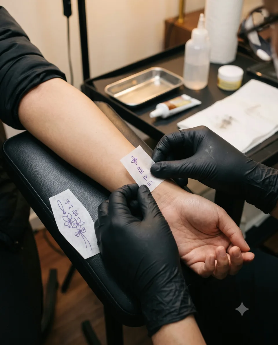
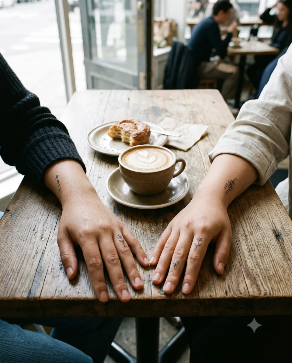
This article is based on the Hangul matching tattoo and finger design posts on the Yeonjae Tattoo Instagram account, plus photos of other pieces on the same theme that I opened and checked directly. The feelings behind the wording and designs are limited to what the posts say, and I have not added anything about the people who received them. The four AI-staged images above were made to help you picture a consultation, and they are not actual tattooing scenes or real clients.
Before you book
Do both people need to be present to ask about a Hangul matching tattoo?
One of you can start the consultation on behalf of both. Send the Hangul wording, a photo of each person's area and a matching photo you like by Instagram DM. Booking and what is possible are explained in an individual consultation.
Does a matching tattoo have to be an identical design?
In the photos, the wrist pair shares the wording but has a different flower arrangement, and the finger pair took one identical design each. Both read as a pair. What stays the same and what differs is decided together in the consultation, based on what each of you prefers.
Which is better for a Hangul pair, the wrist or the finger?
In the photos, the wrist holds a vertical phrase with small flowers and the finger holds a simple design. It depends on how visible you want it in daily life and where you wear rings or watches, so we decide in an individual consultation after seeing a photo of the area.
What information about the Hangul wording should I send first?
Send the exact wording, the spelling and spacing, whether you prefer vertical or horizontal, and a photo of a lettering style you like. If the wording is not settled yet, we can start with the placement and mood.
How can I find out about price and session length?
They depend on the length of the wording, the design and the size, so this article does not state them. Message us on Instagram and we will go over price and session length in an individual consultation.
Key facts
- Location
- 2F, G Studio, 136-11 Eoulmadang-ro, Mapo-gu, Seoul, South Korea
- Opening hours
- Mon–Sat 11:00–23:00 · Closed on Sundays
- Artist
- Yeonjae · China Academy of Art graduate · eighth year in Hongdae (as of 2026)
- Styles
- Fine line · Floral & botanical · Cover-up
- Consultation & booking
- Confirmed after consultation via Instagram DM, LINE or KakaoTalk
- Pricing & time
- Price and session length depend on the design, size and placement, and are explained during the consultation.
China Academy of Art graduate, in her eighth year as a tattoo artist in Hongdae · as of 2026
China Academy of Art is an art university founded in Hangzhou in 1928. Its long history of art education provides context for Yeonjae’s fine-art background. About the academy · official website ↗
Yeonjae Tattoo · Blog
This post brings together the work photographs, published descriptions and guidance for preparing an inquiry. See the artist profile above for the creator’s background.
Photo source: Original artwork & context ↗
Original Instagram caption
Based on the artist’s supplied work notes. Editorial text was prepared with AI assistance.